Fig. 2
Download original image
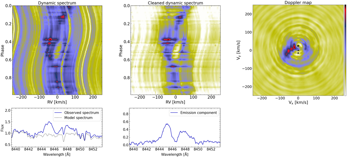
Computation of the Doppler map for the O I line. The dynamic spectrum from the observation (left), the dynamic spectrum after removing the giant contribution (middle), and the Doppler map (right). The color of the dynamic spectra represents the pseudo-continuum-normalized fluxes taken as the median value of the spectral window. The color of the Doppler maps corresponds to arbitrary units of emission intensity. On the Doppler map, the position of the donor is given by an empty circle, that of the accretor by a cross, and the center of mass by the plus sign. The bottom panels show the spectral profile before (left) and after (right) the subtraction of the giant contribution for a spectrum at ϕ = 0.55.
Current usage metrics show cumulative count of Article Views (full-text article views including HTML views, PDF and ePub downloads, according to the available data) and Abstracts Views on Vision4Press platform.
Data correspond to usage on the plateform after 2015. The current usage metrics is available 48-96 hours after online publication and is updated daily on week days.
Initial download of the metrics may take a while.