Fig. 7.
Download original image
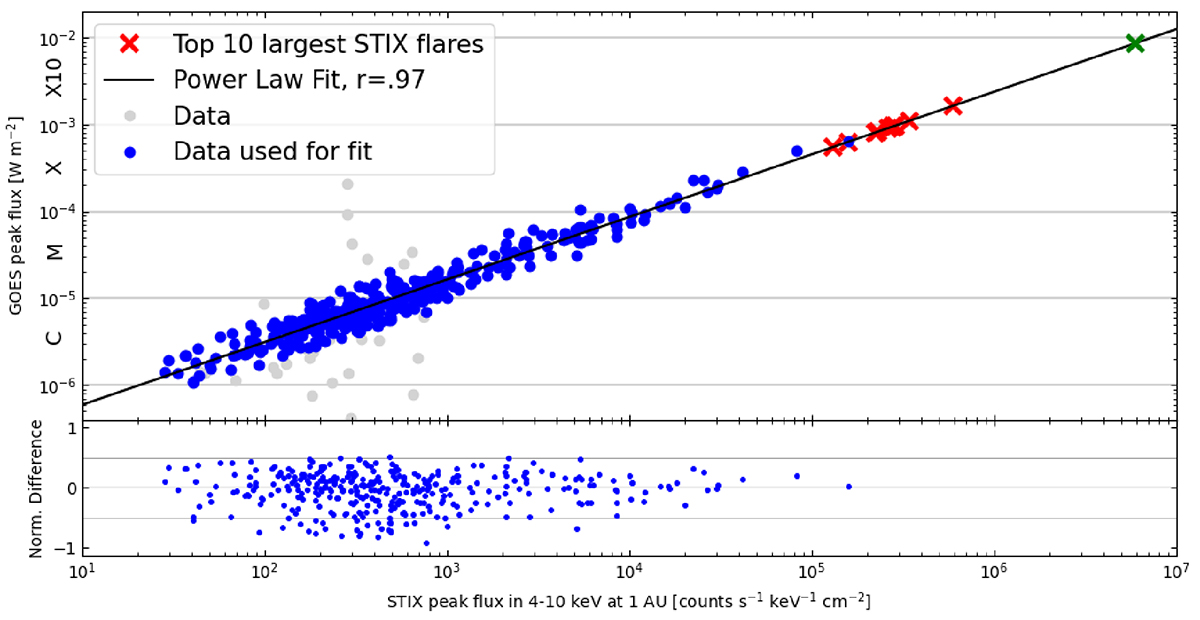
Plots displaying the relation between STIX BKG detector peak flux and GOES peak flux. The blue dots represent the flares used for the fit and the black curve is the fit. We have calculated the Pearson correlation coefficient to measure the linearity of the data in logarithmic scale. The grey dots are the outlier flares which were excluded from the fit. The red crosses represent the ten largest STIX flares in the thermal range up to July 2024. The crosses are plotted using the STIX flux and the fit to estimate the GOES flux. They correspond to the flares listed in Table 2. The green cross marks a conservative upper limit for the largest flare that the STIX BKG detector is able to accurately measure, see the discussion in Section 5. In the lower plot, we give the normalized difference between the data points (individual flares) and the fit.
Current usage metrics show cumulative count of Article Views (full-text article views including HTML views, PDF and ePub downloads, according to the available data) and Abstracts Views on Vision4Press platform.
Data correspond to usage on the plateform after 2015. The current usage metrics is available 48-96 hours after online publication and is updated daily on week days.
Initial download of the metrics may take a while.