Fig. 7
Download original image
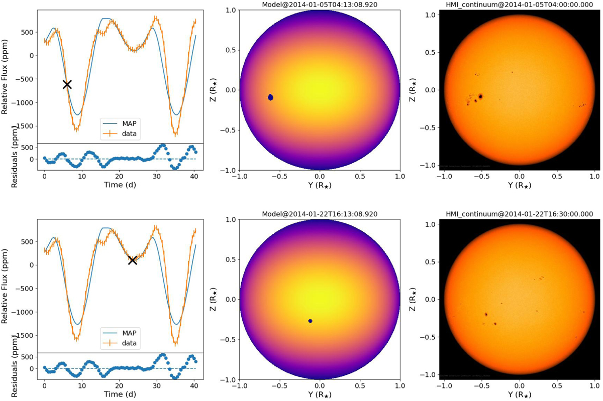
Comparison between best-fit (MAP) model of two-spot configuration versus Sun data. Left panels: synthetic photometric light curve is presented as blue line; binned solar data are shown via orange line with errors. A black cross marks the time at which the model (middle) and actual Sun (right) spot configurations have been shown. Times are shifted with respect to the first of the series. The spot position is reflected with respect to the equator for visualisation purposes, and stellar flux is coloured-coded as in Fig. 1.
Current usage metrics show cumulative count of Article Views (full-text article views including HTML views, PDF and ePub downloads, according to the available data) and Abstracts Views on Vision4Press platform.
Data correspond to usage on the plateform after 2015. The current usage metrics is available 48-96 hours after online publication and is updated daily on week days.
Initial download of the metrics may take a while.