Fig. 11.
Download original image
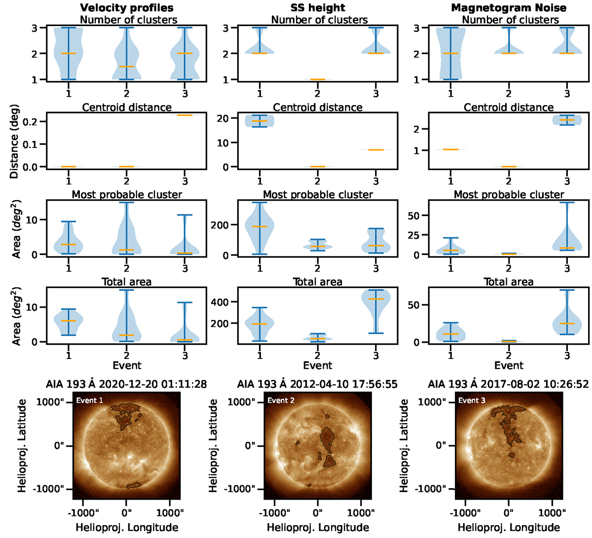
Violin plots (first four rows) of the back-mapping assessment metrics, for every source of uncertainty in Events 1, 2 and 3. The horizontal axis represents the event (high-speed stream) that was examined. Each column corresponds to a source of uncertainty and each row to a statistical quantity: optimal number of clusters, average distance of cluster centroids from the barycenter, the 3-sigma uncertainty area of the most probable cluster and the total 3-sigma uncertainty area. In each violin plot, the median values are indicated with an orange line and the extreme values with light blue lines. Where the violin plot is not visible, the distribution is very concentrated around a single value. The last row displays AIA 193 Å images, taken approximately at the midtime of each event, including the contours of the coronal holes present at the time. Event 1 and 3 are considered as polar coronal hole extensions and Event 2 as a low latitude coronal hole.
Current usage metrics show cumulative count of Article Views (full-text article views including HTML views, PDF and ePub downloads, according to the available data) and Abstracts Views on Vision4Press platform.
Data correspond to usage on the plateform after 2015. The current usage metrics is available 48-96 hours after online publication and is updated daily on week days.
Initial download of the metrics may take a while.