Fig. 5
Download original image
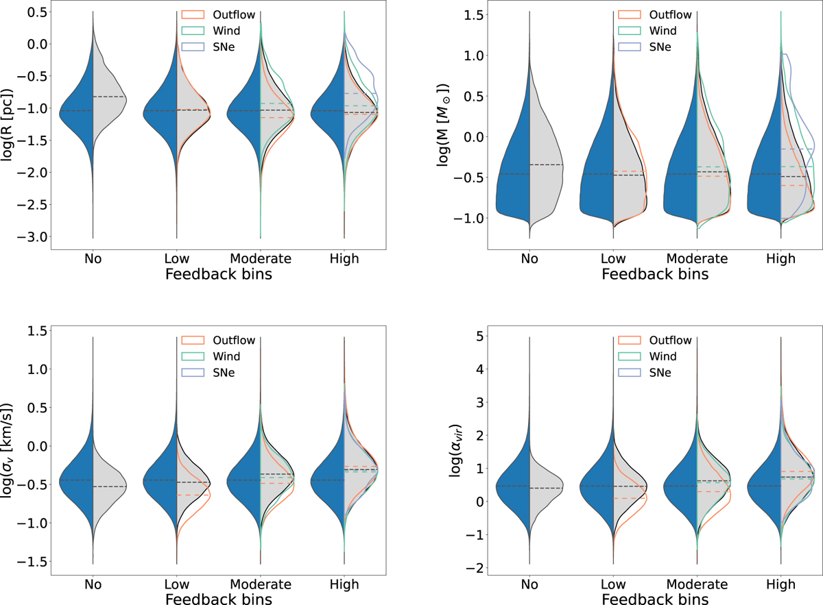
Distributions of the core radius (top left), mass (top right), velocity dispersion (bottom left), and virial parameter (bottom right) in the different feedback bins. The split violin plot presents the total distribution (blue) and the distribution of cores in the global feedback bins (grey) for each axis. The colours representing the outflow, wind, and supernova bins are marked in the legends. The dashed lines represent the medians of the different distributions. Violin plots present the density of the data at different values, which were smoothed using the kernel density estimator.
Current usage metrics show cumulative count of Article Views (full-text article views including HTML views, PDF and ePub downloads, according to the available data) and Abstracts Views on Vision4Press platform.
Data correspond to usage on the plateform after 2015. The current usage metrics is available 48-96 hours after online publication and is updated daily on week days.
Initial download of the metrics may take a while.