Fig. 4
Download original image
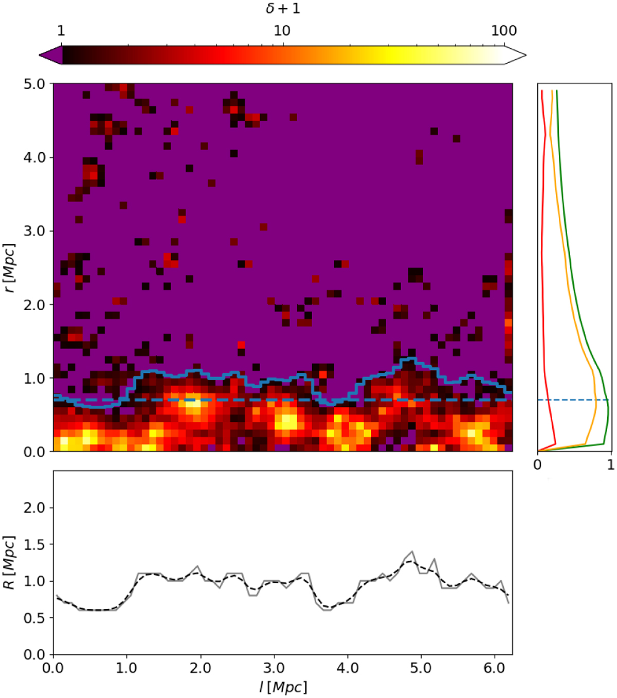
Map of overdensity. The purple regions are below the selected overdensity threshold. The map also contains the computed constant radius, dashed blue line, and the variable radius R(l), indicated with a solid blue line. In the right panel, at each r, we have plotted the frequencies of overdense cells (red line for cells above that r and green line for cells below r) and their difference (yellow line). The constant radius is shown as the radius where the difference in overdense cells is maximum. The variable radius R(l) is plotted at the bottom of the figure. The grey solid line is the calculated radius, while the black dashed line is the radius with the applied Gaussian filter. The dark and red clumps at larger r correspond to a larger overdensity of particles related to substructures. We obtained this map for one of the filaments in the D6 region (AGN simulation).
Current usage metrics show cumulative count of Article Views (full-text article views including HTML views, PDF and ePub downloads, according to the available data) and Abstracts Views on Vision4Press platform.
Data correspond to usage on the plateform after 2015. The current usage metrics is available 48-96 hours after online publication and is updated daily on week days.
Initial download of the metrics may take a while.