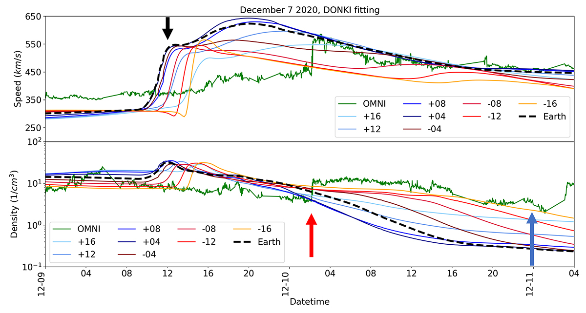
Fig. 3.
Download original image
Comparison of the in situ observations at Earth and the modelled velocity (top panel) and density time series (bottom panel) obtained in EUHFORIA simulations for Event 1. The in situ data are presented as the green line and the modelled time series have different shades according to the position at which they were estimated (blue shades are at the positions above Earth and red shades are time series bellow Earth, see also Fig. 2a). The modelling results were obtained using the CME characteristics from the DONKI database. The red arrow indicates the observed arrival time at Earth. The black arrow indicates the modelled arrival time of the disturbance to Earth (dashed black curve) at zero degree latitude and longitude. The blue arrow indicates the estimated arrival time from the measurements of the radio observations. The modelled arrival time at Earth is significantly earlier than the observed one with Δt ≈ –14h (estimated as a difference between the in situ shock arrival and the middle shock amplitude).
Current usage metrics show cumulative count of Article Views (full-text article views including HTML views, PDF and ePub downloads, according to the available data) and Abstracts Views on Vision4Press platform.
Data correspond to usage on the plateform after 2015. The current usage metrics is available 48-96 hours after online publication and is updated daily on week days.
Initial download of the metrics may take a while.