Fig. B.1.
Download original image
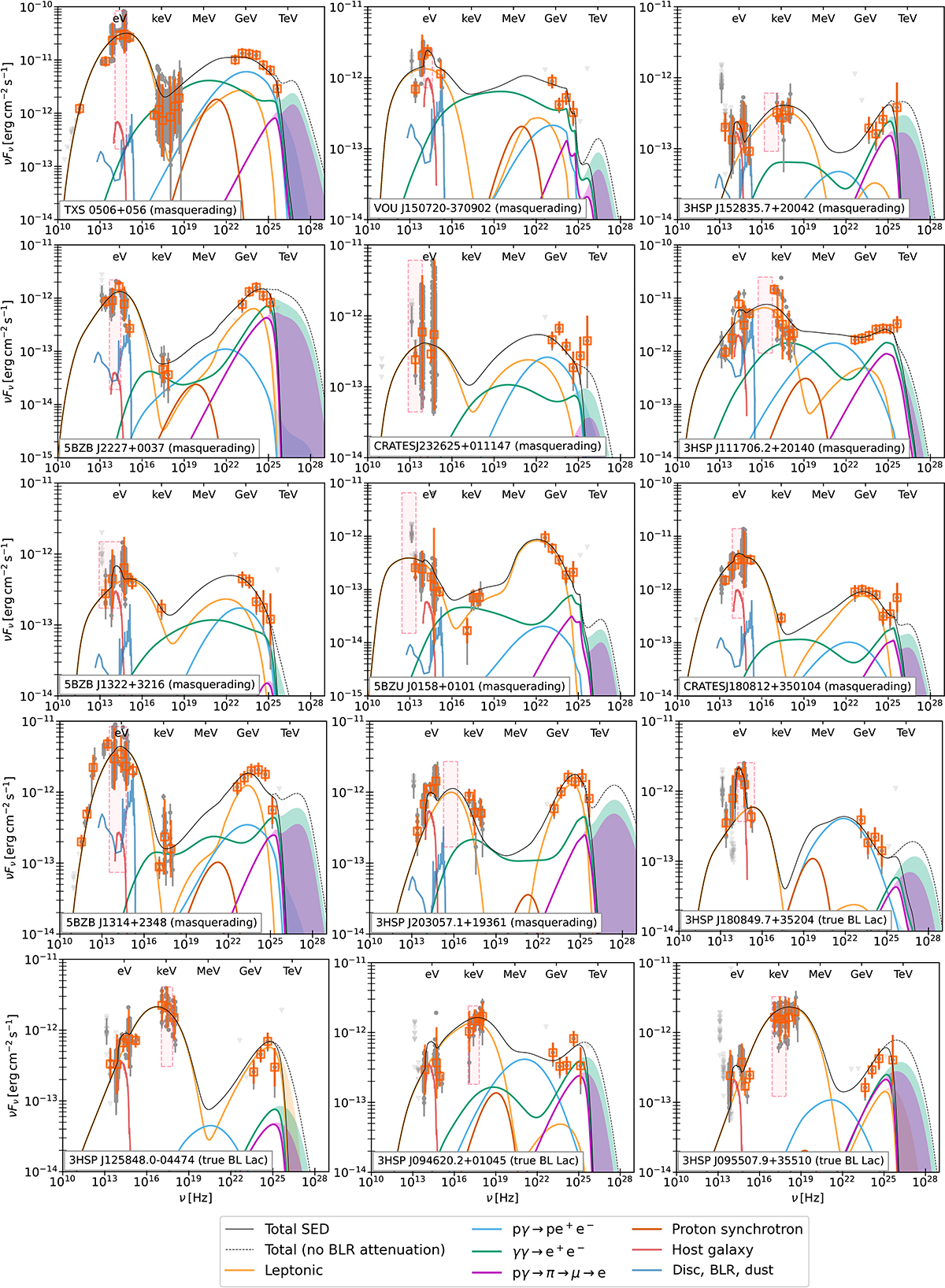
Detailed multiwavelength spectral energy distributions predicted by the best-fit leptohadronic model for each source. The colored curves represent the photon fluxes at the observer, separated by the different processes from which they originate, according to the caption. The colored bands represent the extent of the attenuation on the EBL of each of the components. The rectangular area inside the dashed red lines represents the uncertainty range of the synchrotron peak position, as plotted in Fig. 3 for the entire sample. The gray points show the respective SED. In orange, we show the binned fluxes (cf. Section 2.4).
Current usage metrics show cumulative count of Article Views (full-text article views including HTML views, PDF and ePub downloads, according to the available data) and Abstracts Views on Vision4Press platform.
Data correspond to usage on the plateform after 2015. The current usage metrics is available 48-96 hours after online publication and is updated daily on week days.
Initial download of the metrics may take a while.