Fig. 2.
Download original image
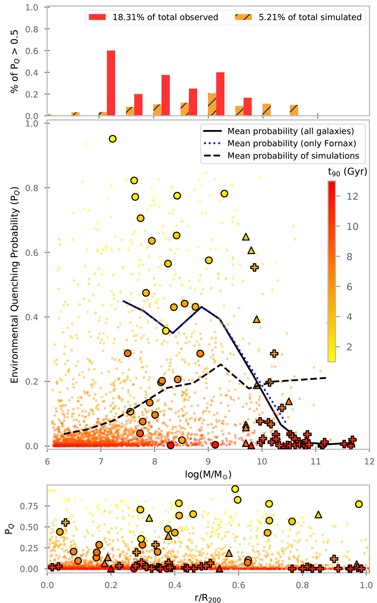
Relation between the environmental quenching probability and the stellar mass. In the top panel, we show a histogram with the percentage of quenched galaxies in different mass bins, separated into observed galaxies in red and simulated galaxies in orange. In the central panel, we present the individual values of PQ as a function of the stellar mass, with symbols colour coded according to t90. In the bottom panel, we show the distribution of PQ as a function of the projected distance. For the observational sample, the symbols are the same as in Fig. 1, and the background points are the simulated galaxies from the Illustris Project. For all the observed galaxies, we include a black line that represents the mean PQ in different mass bins, and a blue dotted line that shows the same fit but only for the galaxies of the Fornax cluster. For the simulated galaxies, the mean PQ is represented by the dashed black line.
Current usage metrics show cumulative count of Article Views (full-text article views including HTML views, PDF and ePub downloads, according to the available data) and Abstracts Views on Vision4Press platform.
Data correspond to usage on the plateform after 2015. The current usage metrics is available 48-96 hours after online publication and is updated daily on week days.
Initial download of the metrics may take a while.