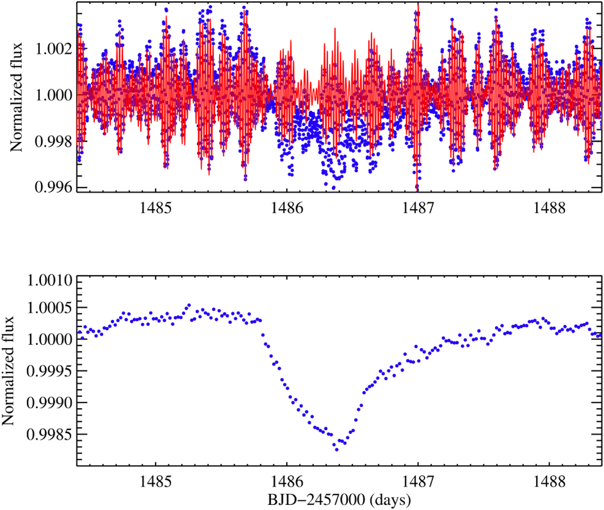
Fig. 2
Download original image
Segment of the β Pic light curve with the deepest exocomet transit. Top: similar to the previous figure, it shows the normalized PDC_SAP flux with the harmonic content (blue dots), and the red line represents the modeled harmonic fluctuations. Bottom: difference between the original flux and the modeled one binned in 30-min intervals.
Current usage metrics show cumulative count of Article Views (full-text article views including HTML views, PDF and ePub downloads, according to the available data) and Abstracts Views on Vision4Press platform.
Data correspond to usage on the plateform after 2015. The current usage metrics is available 48-96 hours after online publication and is updated daily on week days.
Initial download of the metrics may take a while.