Fig. 9
Download original image
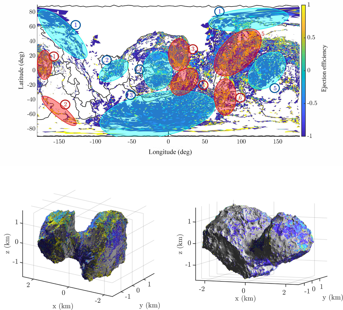
Ejection efficiency for all the sets combined. Blue indicates patches with low efficiency, and yellow regions with enhanced efficiency. The white and gray areas represent zones that did not provide any candidate in top and bottom panels, respectively. Red and blue ellipses show the identified high and low efficiency clusters, respectively.
Current usage metrics show cumulative count of Article Views (full-text article views including HTML views, PDF and ePub downloads, according to the available data) and Abstracts Views on Vision4Press platform.
Data correspond to usage on the plateform after 2015. The current usage metrics is available 48-96 hours after online publication and is updated daily on week days.
Initial download of the metrics may take a while.