Fig. 12
Download original image
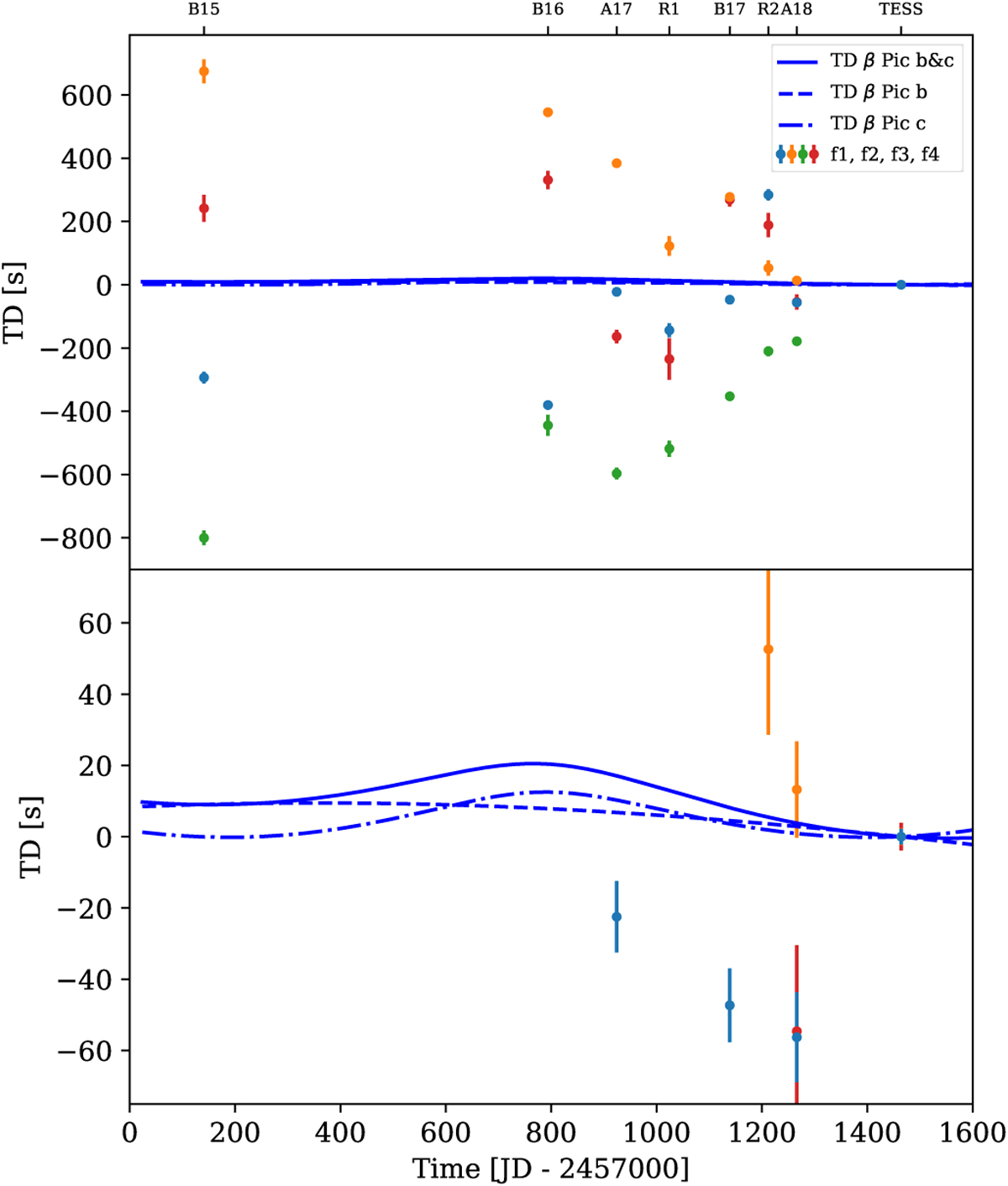
Time delay plot for the simulated data set showing a high similarity to the time delays of the real data set presented in Fig. 12. The colored points represent the simulated time delays for the four strongest pulsational frequencies. The blue lines indicate time delay predictions for β Pictoris b (dashed line), c (dashed-dotted line), and both planets (solid line). The lower panel is a zoom-in of the upper panel. A description of the ticks at the top of the plot can be found in the caption of Fig. 11.
Current usage metrics show cumulative count of Article Views (full-text article views including HTML views, PDF and ePub downloads, according to the available data) and Abstracts Views on Vision4Press platform.
Data correspond to usage on the plateform after 2015. The current usage metrics is available 48-96 hours after online publication and is updated daily on week days.
Initial download of the metrics may take a while.