Fig. 11
Download original image
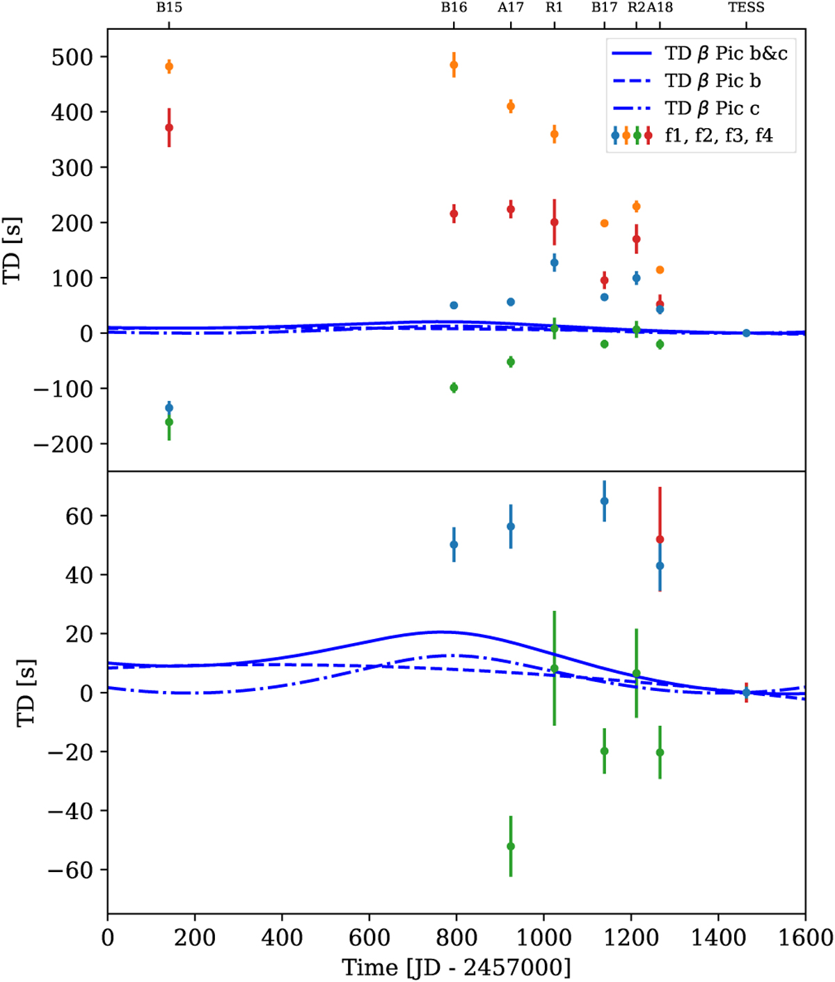
Time delay plot calculated from the phases of four different frequencies for all available observations by BRITE, bRing, ASTEP and TESS. Each color represents a frequency (ƒl, ƒ2, ƒ3, and ƒ4) listed in Table A.1. The blue lines indicate time delay predictions for β Pictoris b (dashed line), c (dashed, dotted line), and both planets (solid line). The lower panel is a zoom-in of the upper panel. The uncertainties in the time delays were derived from the covariance matrices given by the least-squares procedure, which was used in order to calculate the phases of the respective frequencies. The ticks at the top of the plot denote the various observatories: B 15, B 16, and B 17 for the BRITE observations in the years 2015, 2016, and 2017, respectively; A17 and A18 for the ASTEP observations in 2017 and 2018; and Rl and R2 for the first and second part of the bRing data.
Current usage metrics show cumulative count of Article Views (full-text article views including HTML views, PDF and ePub downloads, according to the available data) and Abstracts Views on Vision4Press platform.
Data correspond to usage on the plateform after 2015. The current usage metrics is available 48-96 hours after online publication and is updated daily on week days.
Initial download of the metrics may take a while.