Fig. 13.
Download original image
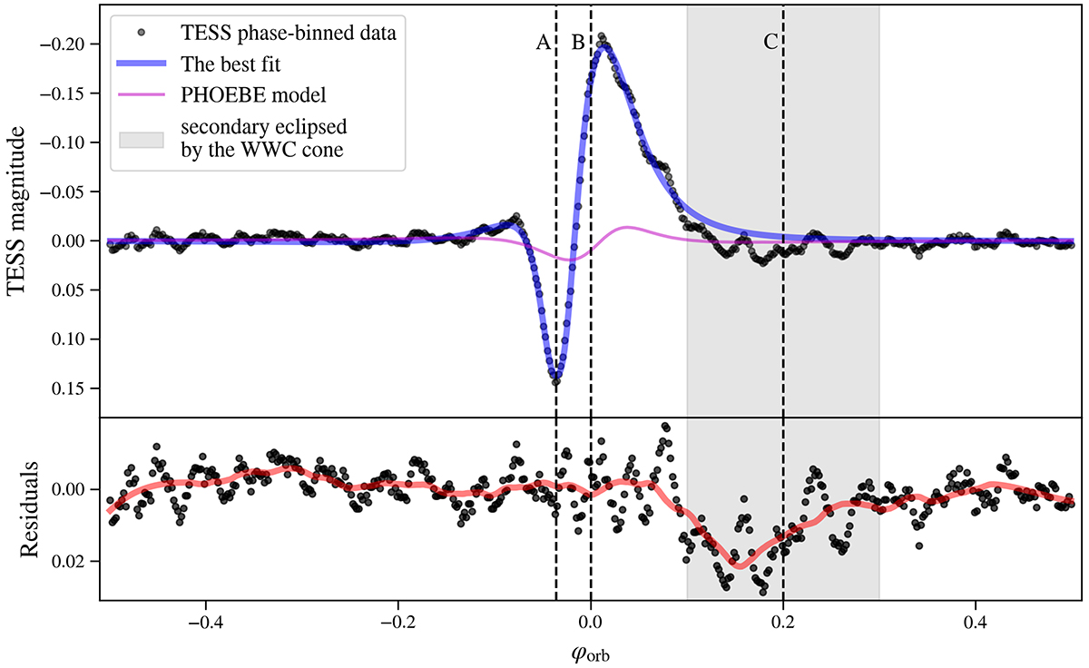
Plot summarizing the fit of our analytical variability model (Sects. 5.1 and 5.2) to the TESS light curve of ExtEV. The upper panel shows the TESS light curve binned in the orbital phase (black dots) with the best-fit model (blue curve) superimposed. The pink line corresponds to the variability model generated with PHOEBE. Phases A, B, and C from Fig. 12 are shown with vertical dashed lines and labeled. The vertical shaded region marks the range of orbital phases where we expect the secondary component to be partially obscured by the WWC cone. The lower panel shows the residuals from the best fit and their smoothed version (red curve). The zero phase corresponds to the time of periastron passage. More details can be found in the main text.
Current usage metrics show cumulative count of Article Views (full-text article views including HTML views, PDF and ePub downloads, according to the available data) and Abstracts Views on Vision4Press platform.
Data correspond to usage on the plateform after 2015. The current usage metrics is available 48-96 hours after online publication and is updated daily on week days.
Initial download of the metrics may take a while.