Fig. 2.
Download original image
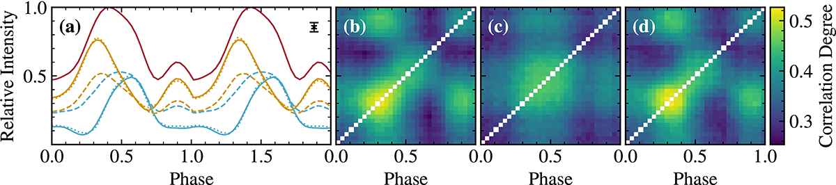
Results of the NMF decomposition and rescaling of an example simulated dataset. In panel a, the simulated contributions of the two poles of an XRP are shown as blue and yellow solid lines. The sum of these components is the “observed” pulse profile (red solid line). The resulting contributions of the NMF decomposition, shown as blue and yellow dashed lines, are close to the input contributions (solid), only the relative scaling is not recovered fully. After optimisation using the correlation properties, the recovered signals are closer to the input (blue and yellow dotted lines). The estimated minimum and maximum uncertainties are shown in the upper right-hand corner. Two pulse phases are shown for clarity. Panel b shows the correlation matrix of the original simulated data. Panel c shows that when simulating data based on the two components of the NMF decomposition, the correlation matrix appears to be less correlated than the original b. Panel d shows the correlation matrix of a simulation based on the optimisation of scaling of the components. This results in a better representation compared to the input matrix b.
Current usage metrics show cumulative count of Article Views (full-text article views including HTML views, PDF and ePub downloads, according to the available data) and Abstracts Views on Vision4Press platform.
Data correspond to usage on the plateform after 2015. The current usage metrics is available 48-96 hours after online publication and is updated daily on week days.
Initial download of the metrics may take a while.