Fig. 8.
Download original image
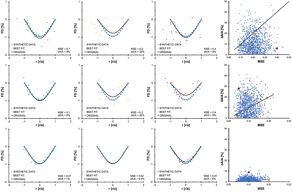
Synthetic data and the best-fit results for several selected examples. Different examples correspond to different combinations of data imperfection effects, where the set of values of the data imperfection effects is different for different rows and varies from high to low and top to bottom, respectively: (1) top: Y-noise = 30%, X-noise = 30%, asym = 0.15%, gap position = 3, gap size = 30%, data resolution = 20 pts; (2) middle: Y-noise = 20%, X-noise = 20%, asym = 0.10%, gap position = 2, gap size = 20%, data resolution = 20 pts; (3) bottom: Y-noise = 5%, X-noise = 5%, asym = 0.05%, gap position = 2, gap size = 10%, data resolution = 20 pts. The right-most plot in each row shows the scatter of different dA/A and MSE values obtained through 1000 runs for the same maximum data imperfection effect levels. Different combinations of data imperfection effects may lead to different MSE and dA/A behaviour. The three examples shown left of the corresponding scatter plot are highlighted in a colour corresponding to the colour of the synthetic data for the given event (green for the left-most, yellow for the middle, and red for the right-most examples). Blue data points correspond to the original theoretical curve, and the best-fit function is given by the black curve.
Current usage metrics show cumulative count of Article Views (full-text article views including HTML views, PDF and ePub downloads, according to the available data) and Abstracts Views on Vision4Press platform.
Data correspond to usage on the plateform after 2015. The current usage metrics is available 48-96 hours after online publication and is updated daily on week days.
Initial download of the metrics may take a while.