Fig. 1
Download original image
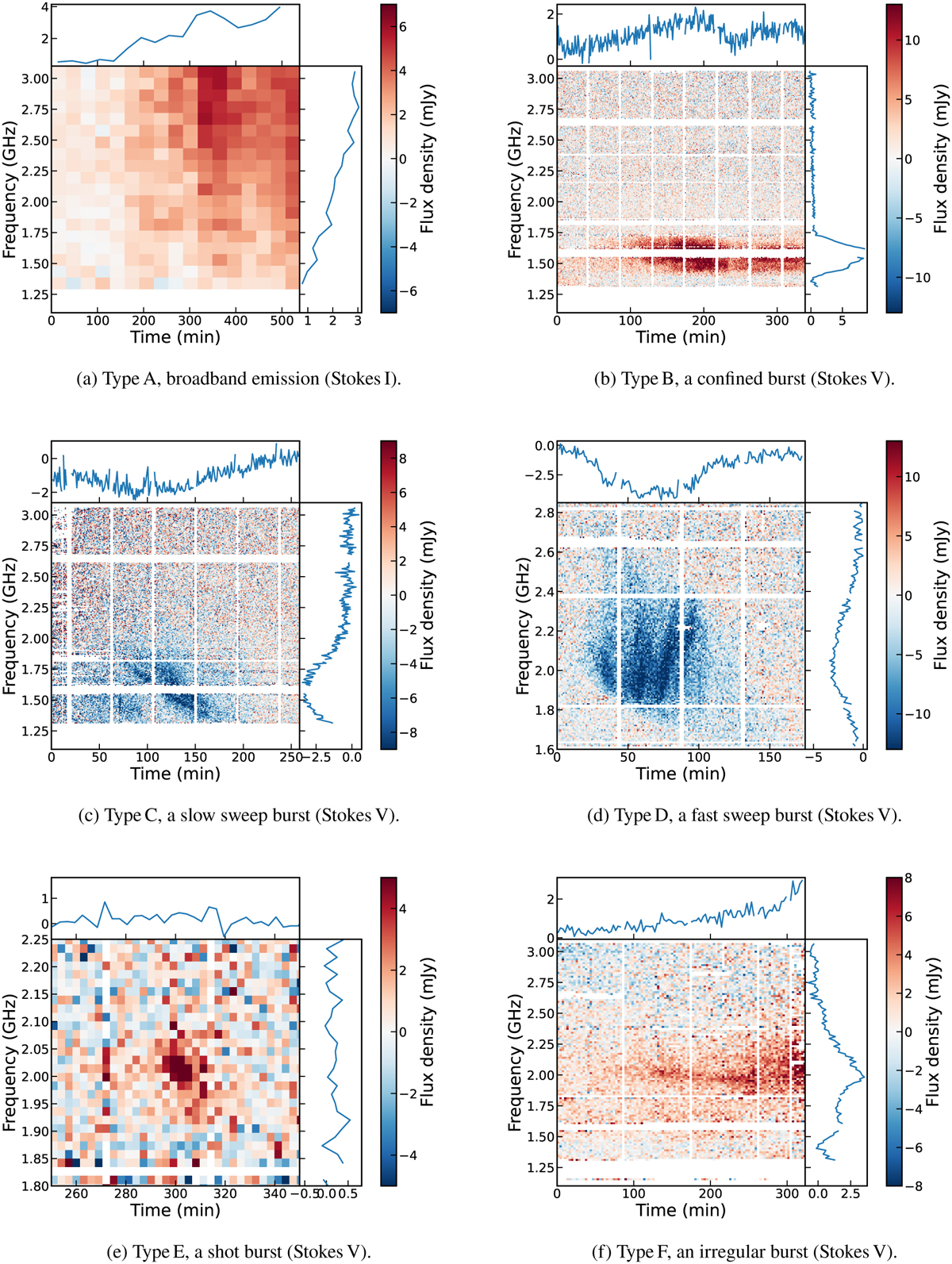
Dynamic spectra of the 6 different types of emission detected on AU Mic. Note that the colour scale and the axes are not the same for each figure. Panel a is binned into time bins of 30 min and frequency bins of 100 MHz. Panels b through e are binned into time bins of 1 min and frequency bins of 8 MHz, and panel f is binned into time bins of 3 min and frequency bins of 16 MHz. For each plot, the colour bar shows the flux density, with frequency on the vertical axis and time on the horizontal axis. On the top, a light curve is plotted, averaged over all frequencies. To the side, we plot a spectrum of the emission, averaging over all time integrations. White regions in the plots indicate parts of the data that have been completely flagged.
Current usage metrics show cumulative count of Article Views (full-text article views including HTML views, PDF and ePub downloads, according to the available data) and Abstracts Views on Vision4Press platform.
Data correspond to usage on the plateform after 2015. The current usage metrics is available 48-96 hours after online publication and is updated daily on week days.
Initial download of the metrics may take a while.