Fig. 4
Download original image
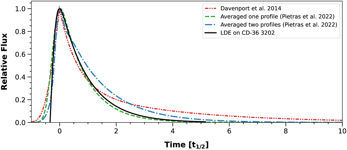
Comparision of averaged flare profiles from Davenport et al. (2014) and Pietras et al. (2022) with the profile of the long-duration event analyzed here. The red curve presents the average flare profile presented by Davenport et al. (2014). The blue and green curves present the average flare profiles presented by Pietras et al. (2022). The green curve corresponds to the one fitted profile and the blue curve is a combination of two profiles. The black dashed curve corresponds to the analyzed modulated flare.
Current usage metrics show cumulative count of Article Views (full-text article views including HTML views, PDF and ePub downloads, according to the available data) and Abstracts Views on Vision4Press platform.
Data correspond to usage on the plateform after 2015. The current usage metrics is available 48-96 hours after online publication and is updated daily on week days.
Initial download of the metrics may take a while.