Fig. 1.
Download original image
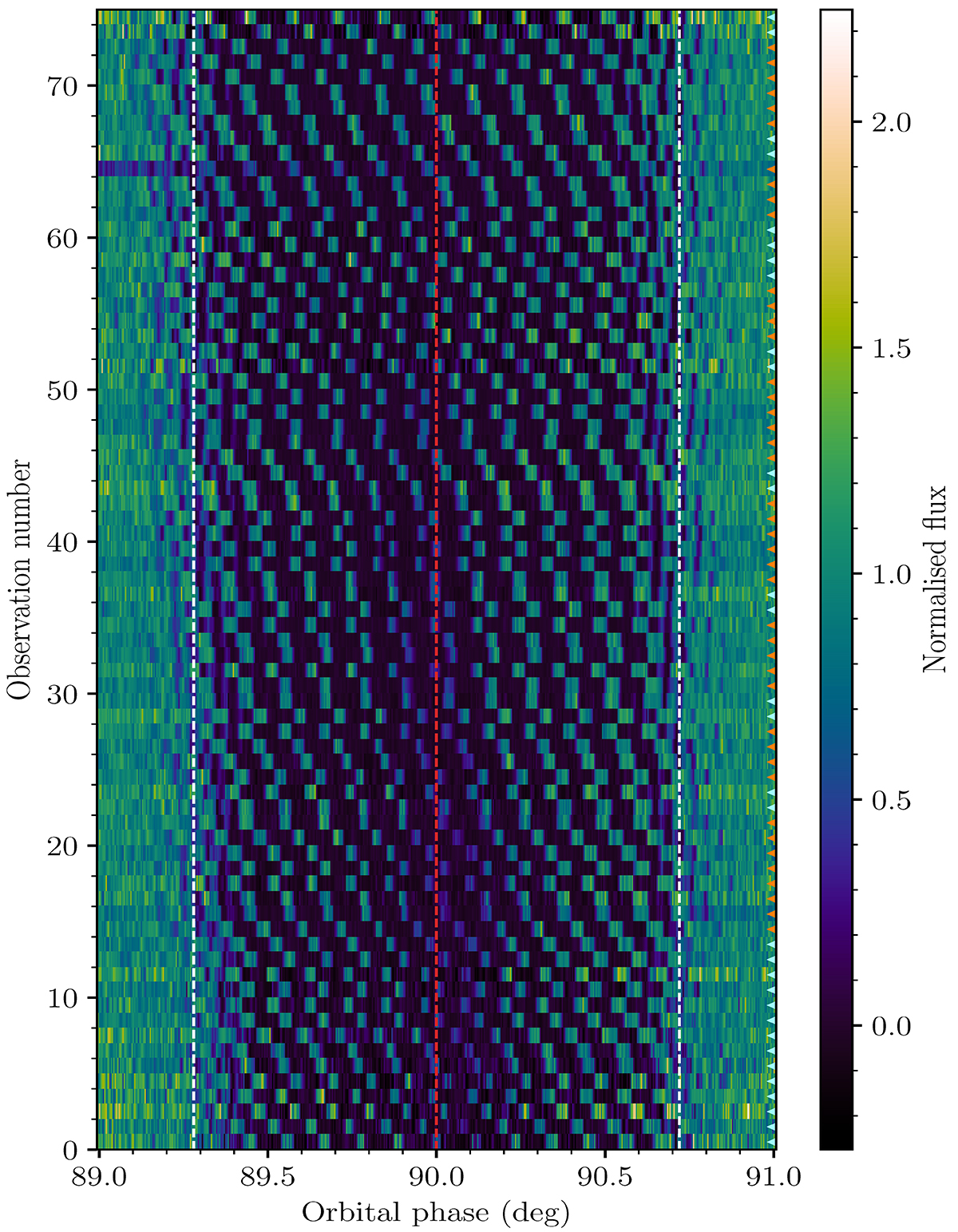
Normalised intensity of pulsar A throughout each of the eclipses recorded by MeerKAT. The red vertical line indicates the orbital phase of superior conjunction. Regions contained within the white lines correspond to where the light curve model best matches the data (see Sect. 4.1). Cyan and orange indicators on the right-hand side denote light-curves obtained using the L-band and UHF receivers respectively. We note that the observation numbers on the y-axis do not increase linearly with time.
Current usage metrics show cumulative count of Article Views (full-text article views including HTML views, PDF and ePub downloads, according to the available data) and Abstracts Views on Vision4Press platform.
Data correspond to usage on the plateform after 2015. The current usage metrics is available 48-96 hours after online publication and is updated daily on week days.
Initial download of the metrics may take a while.