Fig. 6.
Download original image
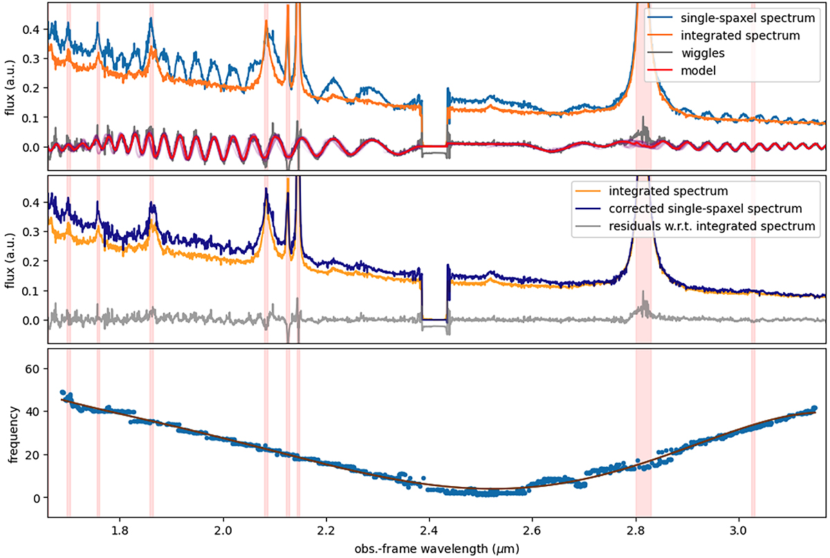
Modelling of the wiggles in single-spaxel spectra. Top panel: integrated LBQS 0302−0019 spectrum (orange curve), single-spaxel spectrum (blue), and wiggles (grey) as already reported in Fig. 5. The red curve represents the best-fit model of the wiggles. Central panel: single-spaxel spectrum after the correction for the wiggles (dark blue), in comparison with the integrated spectrum (orange); the grey curve represents the new residuals with respect to the integrated spectrum. Bottom panel: best parameter for the frequency of the sinusoidal functions used to model the wiggles (blue points); a low-order polynomial function fitting these points is also reported. All panels display red shaded regions (associated with the QSO emission lines) that are excluded during the fit.
Current usage metrics show cumulative count of Article Views (full-text article views including HTML views, PDF and ePub downloads, according to the available data) and Abstracts Views on Vision4Press platform.
Data correspond to usage on the plateform after 2015. The current usage metrics is available 48-96 hours after online publication and is updated daily on week days.
Initial download of the metrics may take a while.