Fig. 2.
Download original image
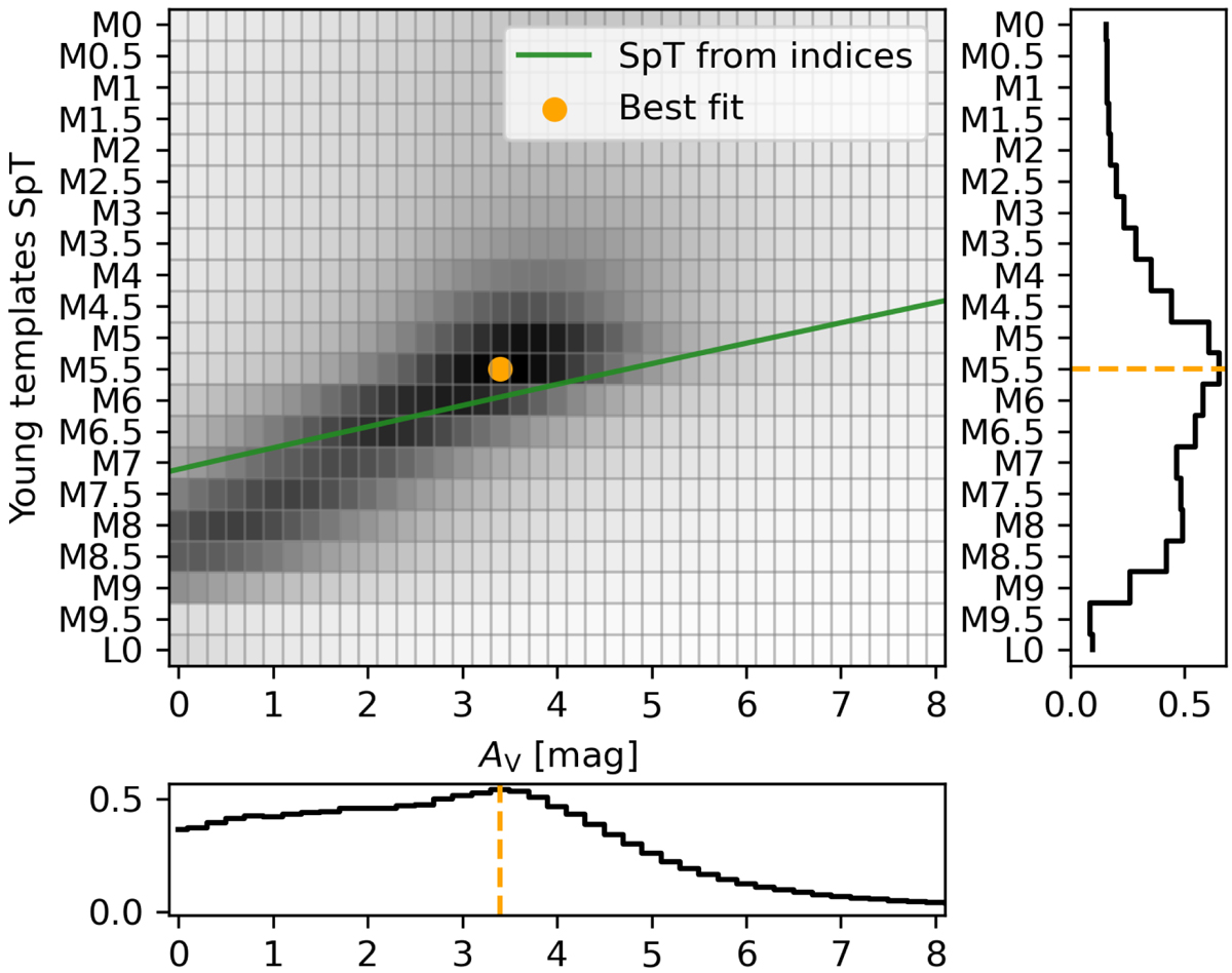
Probability map of SpT and AV from comparison with spectral templates. Darker regions represent lower values of χ2 from the comparison with the young templates for object #40. We show the best fit SpT and AV in orange. The green line represents the SpT derived from a combination of various spectral indices (see Sect. 3.1.3) for the entire AV grid. At the right and bottom panels we also show the χ2 histogram of SpT and AV.
Current usage metrics show cumulative count of Article Views (full-text article views including HTML views, PDF and ePub downloads, according to the available data) and Abstracts Views on Vision4Press platform.
Data correspond to usage on the plateform after 2015. The current usage metrics is available 48-96 hours after online publication and is updated daily on week days.
Initial download of the metrics may take a while.