Fig. 11.
Download original image
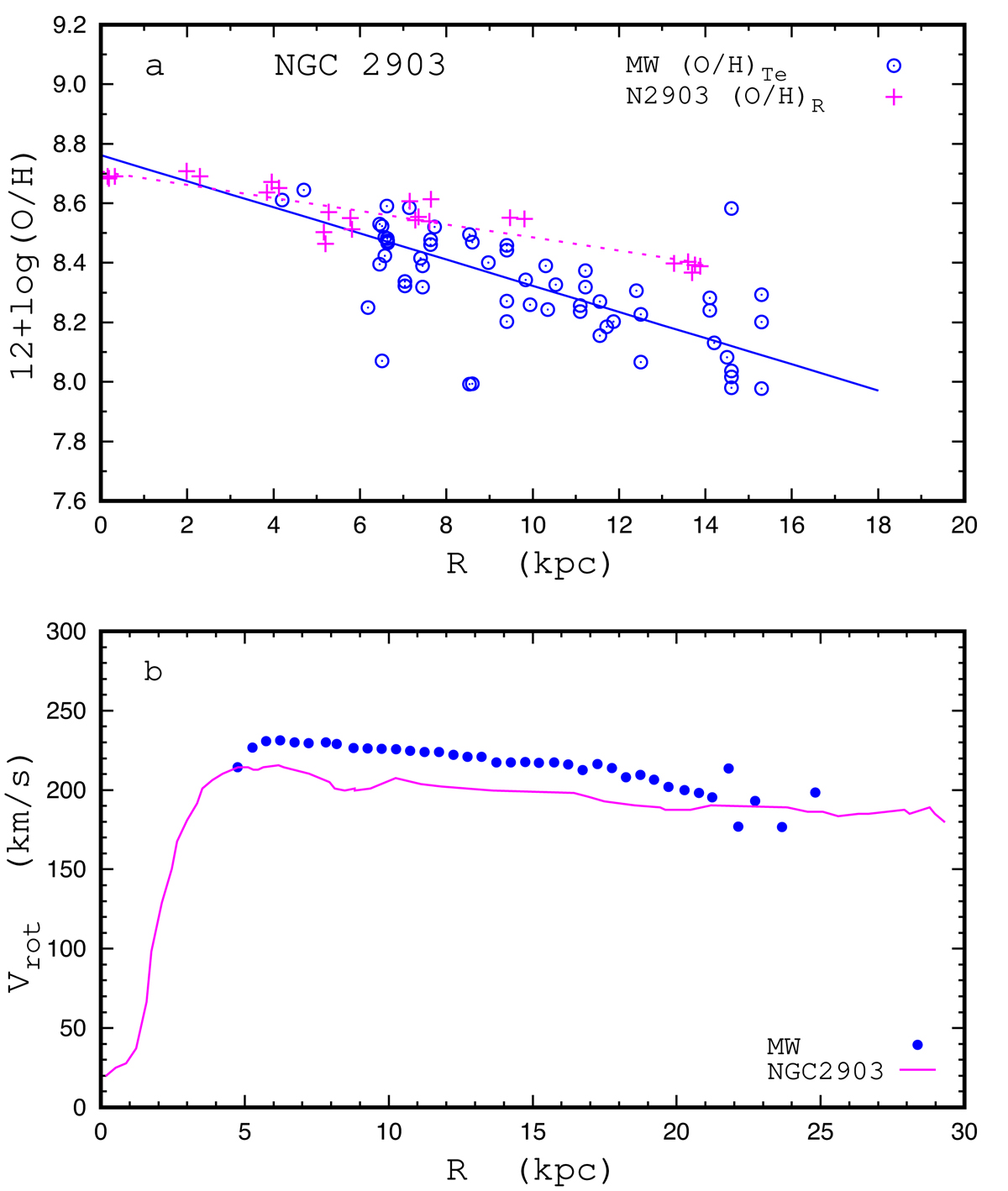
Comparison of properties between NGC 2903 and the Milky Way. Panel a: comparison between radial oxygen abundance distributions. The blue circles denote the Te-based abundances in individual H II regions in the Milky Way (comes from panel b of Fig. 2), and the solid line is the best fit to those data. The crimson plus signs are the R calibration-based abundances in H II regions of NGC 2903, and the dotted line is the linear fit to those data points. Panel b: comparison between rotation curves. The points denote the rotation curve of the Milky Way from Eilers et al. (2019). The rotation curve of NGC 2903 from de Blok et al. (2008) is shown with the line.
Current usage metrics show cumulative count of Article Views (full-text article views including HTML views, PDF and ePub downloads, according to the available data) and Abstracts Views on Vision4Press platform.
Data correspond to usage on the plateform after 2015. The current usage metrics is available 48-96 hours after online publication and is updated daily on week days.
Initial download of the metrics may take a while.