Fig. 10.
Download original image
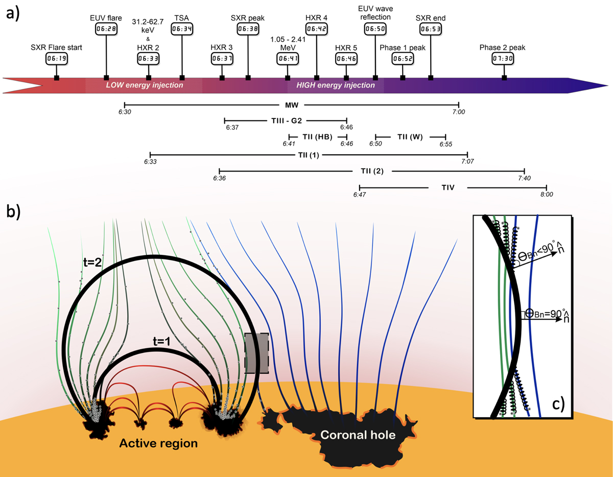
Events during the first phase that led to the first in situ component. (a) Timeline of the features associated with the two different electron injections during the first phase. The exact times of the observational features are marked on the timeline bar. The gradient on the bar is red to blue, indicating the transition between the low- and high-energy releases close to the Sun. The long-lasting radio features are marked below the timeline. (b) Illustration of the shock wave propagation during the first phase. The coronal shock waves during the low-energy release (t = 1) and high-energy release (t = 2) are represented by the black arcs. The open field lines from the periphery of the AR are represented by the green lines, while those from the adjacent coronal hole are represented by blue lines. The closed field lines in the AR are denoted by the red coloured lines. The abundance of energetic electrons is denoted by the small grey dots. The transparent grey rectangle is zoomed into in panel (c) and shows the shock wave’s lateral expansion into nearby open magnetic field lines. The shock normal is denoted by the arrow and the ![]() . The perpendicular and near-perpendicular geometry is represented by θBn ≈ 90° and θBn < 90°. The electrons accelerated at the shock front on either side of the θBn ≈ 90° part of the shock wave are marked by the spirals along the magnetic field lines. More details are provided in the text.
. The perpendicular and near-perpendicular geometry is represented by θBn ≈ 90° and θBn < 90°. The electrons accelerated at the shock front on either side of the θBn ≈ 90° part of the shock wave are marked by the spirals along the magnetic field lines. More details are provided in the text.
Current usage metrics show cumulative count of Article Views (full-text article views including HTML views, PDF and ePub downloads, according to the available data) and Abstracts Views on Vision4Press platform.
Data correspond to usage on the plateform after 2015. The current usage metrics is available 48-96 hours after online publication and is updated daily on week days.
Initial download of the metrics may take a while.