Fig. 4.
Download original image
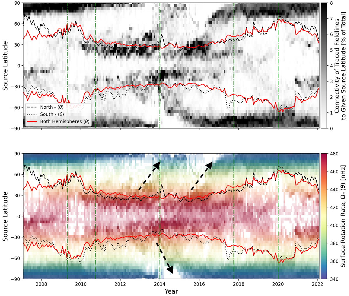
Histogram of the source latitudes of magnetic field lines traced down from the source surface for each magnetogram in our time-series. The top panel indicates, for each model, the percentage of field lines that connect to a given latitude (bin width ∼2°) from a homogeneous sampling of the source surface. The bottom panel blends this information with that of the rotation rate at those latitudes, i.e. the more vivid the colours the larger the fraction of field lines connecting to that latitude (as in the panel above). Arrows indicate the major pole-ward surges of magnetic flux during solar cycle 24. The snapshots shown in Fig. 3 are identified with green vertical dot-dashed lines in both panels. The mean latitude of connectivity (including a factor of sin θ to match ⟨Ωwind⟩) is shown with red solid lines. The same calculation is repeated for the northern and southern hemispheres individually, plotted in black dashed and dotted lines respectively; highlighting the degree of asymmetry.
Current usage metrics show cumulative count of Article Views (full-text article views including HTML views, PDF and ePub downloads, according to the available data) and Abstracts Views on Vision4Press platform.
Data correspond to usage on the plateform after 2015. The current usage metrics is available 48-96 hours after online publication and is updated daily on week days.
Initial download of the metrics may take a while.