Fig. 4
Download original image
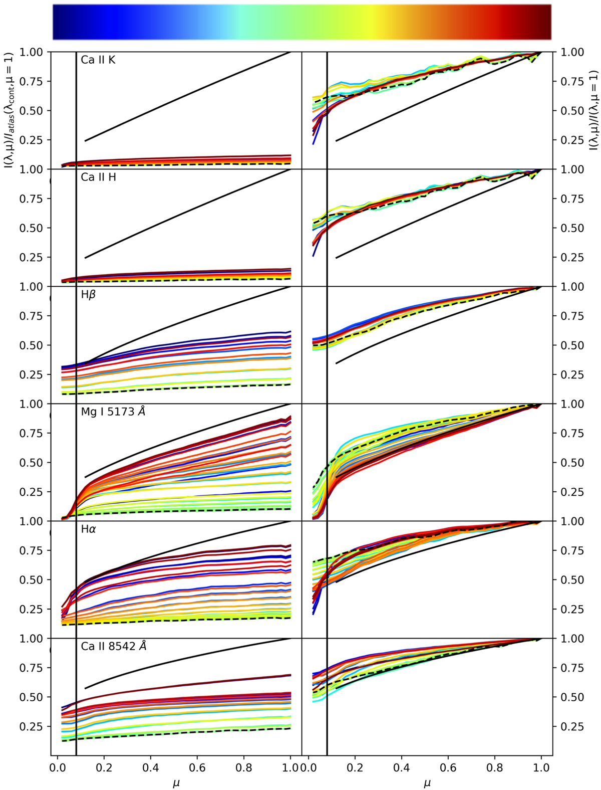
CLV curves of our chromospheric lines ordered by wavelength. In the left column, each CLV curve is shown in atlas calibrated intensities, in the right column each curve is normalized to one to better illustrate the differences in gradient of each wavelength point. The colors of the lines show their approximate wavelength position within the profile, with blue being the blue wing, green the line core, and red the red wing (see colorbar above the plots). The continuum intensity by Neckel & Labs (1994) is denoted by a solid black line, and the line core by a dashed black line. Figure 5 shows an enlarged version of the first two panels in the left column. We only plot every other wavelength point to preserve clarity in the figure. The black line at μ = 0.08 indicates the point to which we trust the accuracy of our data.
Current usage metrics show cumulative count of Article Views (full-text article views including HTML views, PDF and ePub downloads, according to the available data) and Abstracts Views on Vision4Press platform.
Data correspond to usage on the plateform after 2015. The current usage metrics is available 48-96 hours after online publication and is updated daily on week days.
Initial download of the metrics may take a while.