Fig. A.1
Download original image
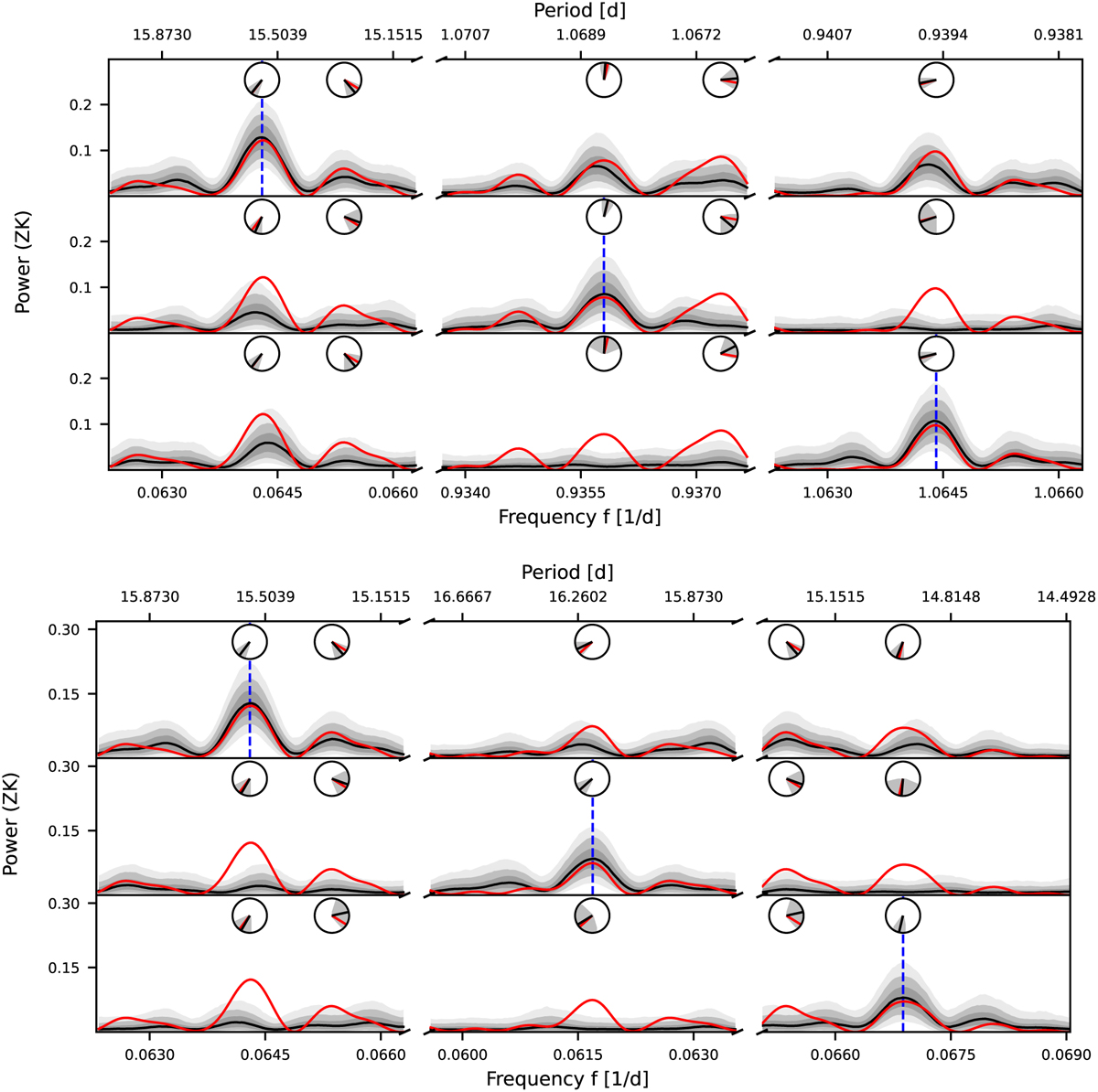
Plots generated by AliasFinder for the daily (top) and yearly (bottom) aliases for the 15.6 d signal. Each row illustrates the results for one simulated frequency, as indicated by the dashed blue vertical line. Each column is centered on a frequency window corresponding to the simulated frequencies. The red line represents the periodogram of the original data set, whereas the black line is the median of the simulations, and the gray shaded regions depict the interquartile range and the confidence range of 90% and 99% of the simulations. The clock diagrams indicate the phase.
Current usage metrics show cumulative count of Article Views (full-text article views including HTML views, PDF and ePub downloads, according to the available data) and Abstracts Views on Vision4Press platform.
Data correspond to usage on the plateform after 2015. The current usage metrics is available 48-96 hours after online publication and is updated daily on week days.
Initial download of the metrics may take a while.