Fig. 7.
Download original image
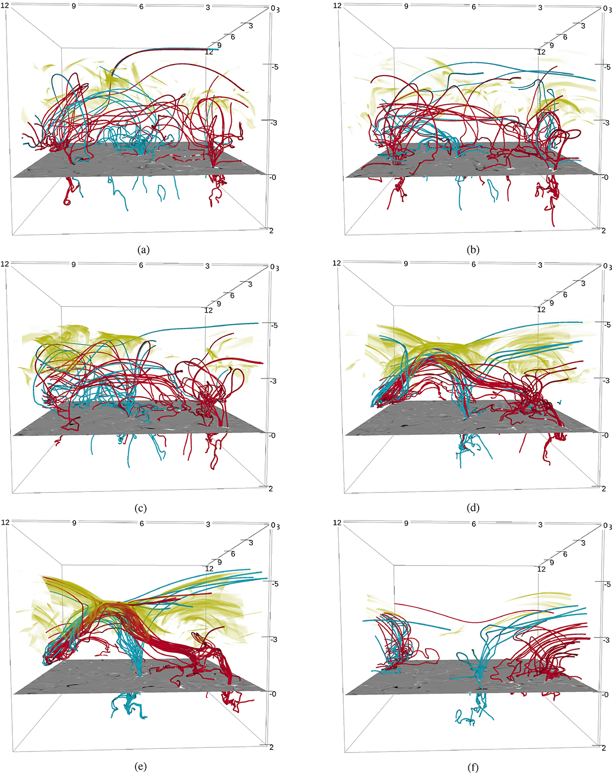
Time series of visualizations of the magnetic field lines seeded and traced by selected corks in the corona. The cyan lines represent an arcade structure while the red lines represent a horizontal flux rope during the time of reconnection. The yellow patches are a volume rendering of Joule heating for each timestamp. A photospheric magnetogram is given for reference. (a) t = 9 669 s. (b) t = 10 339 s. (c) t = 10 840 s. (d) t = 11 270 s. (e) t = 11 360 s. (f) t = 12 070 s.
Current usage metrics show cumulative count of Article Views (full-text article views including HTML views, PDF and ePub downloads, according to the available data) and Abstracts Views on Vision4Press platform.
Data correspond to usage on the plateform after 2015. The current usage metrics is available 48-96 hours after online publication and is updated daily on week days.
Initial download of the metrics may take a while.