Fig. 6
Download original image
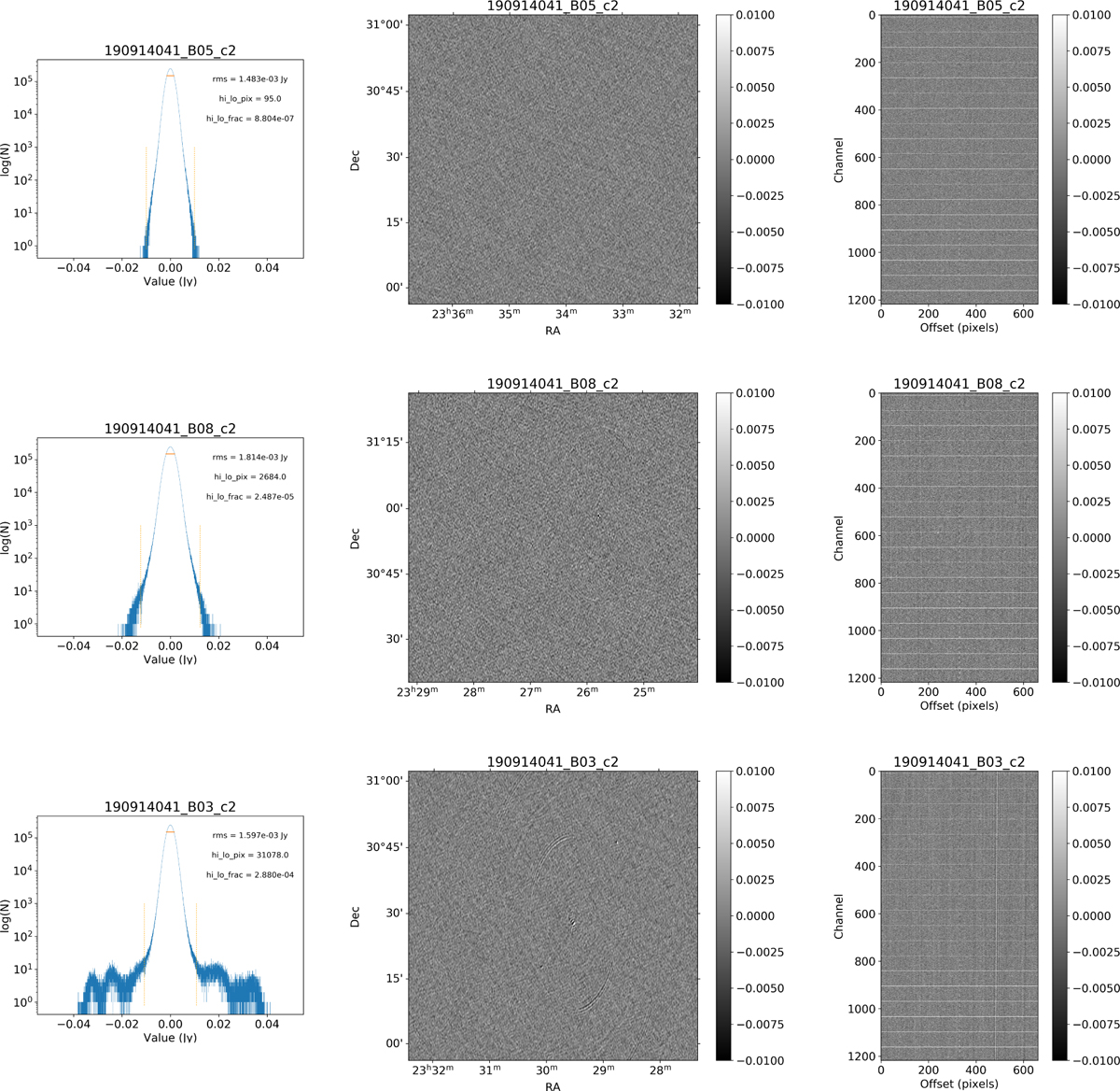
Examples of the three quality classes used for the HI quality assessment. The top row shows an example of a “good” observation (ObsID 190914041, beam 5, cube 2), the middle one an “okay” observation (ObsID 190914041, beam 8, cube 2) and the bottom one a “bad” observation (ObsID 190914041, beam 3, cube 2). The columns show, from left to right, the noise histogram, an extract of the central velocity channel, and a position-velocity diagram through the center of the cube (the horizontal lines in the position-velocity diagrams are the subband edges; see Sect. 7.2). In the left column, the short horizontal line indicates the rms, σ, and the two dotted vertical lines indicate ±6.75σ. The “good” observation in the top row shows hardly any artifacts and a Gaussian noise histogram. The “okay” observation in the middle row shows a minor continuum subtraction artifact, which causes somewhat extended wings to the noise histogram. The “bad” observation in the bottom row shows significant continuum subtraction artifacts, resulting in a very non-Gaussian noise histogram.
Current usage metrics show cumulative count of Article Views (full-text article views including HTML views, PDF and ePub downloads, according to the available data) and Abstracts Views on Vision4Press platform.
Data correspond to usage on the plateform after 2015. The current usage metrics is available 48-96 hours after online publication and is updated daily on week days.
Initial download of the metrics may take a while.