Fig. 3.
Download original image
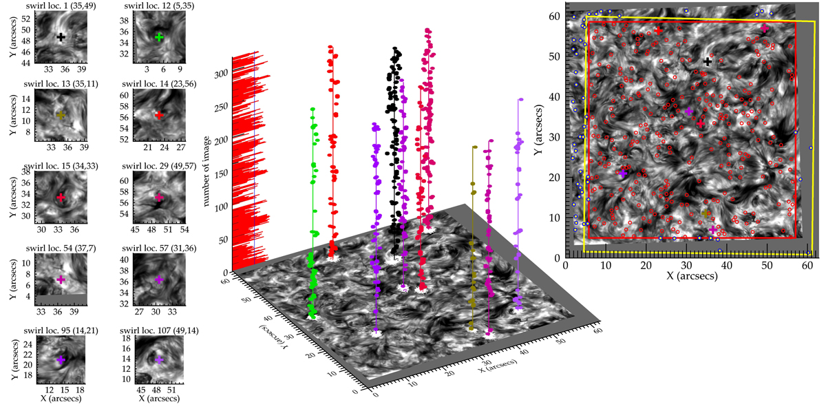
Spatial and temporal evolution of the detected swirl centers. The panels at the left part of the figure correspond to snapshots of 10 out of 350 randomly selected swirl locations detected by the algorithm, as they appear in the first image of the Hα-0.2 Å time series. The colored crosses represent the overall center of each swirl location. The 3D plot in the middle depicts the temporal evolution of the centers of the co-located swirling events, as derived by the second level clustering which reside within these 10 locations prior to the application of the adopted assumptions (see text). The FWHM barplot is overplotted on the z-axis for cross-reference of low quality or missing images. The right panel shows the entire FoV of the first image of the Hα-0.2 Å dataseries, with all the detected 350 swirling locations, along with the borders of the FOV after the displacement (yellow rectangle) and the common FoV (red rectangle). The 10 swirl location centers are overplotted as colored crosses along with the remaining swirl locations both within (red circles) and outside of (blue circles) the common FoV.
Current usage metrics show cumulative count of Article Views (full-text article views including HTML views, PDF and ePub downloads, according to the available data) and Abstracts Views on Vision4Press platform.
Data correspond to usage on the plateform after 2015. The current usage metrics is available 48-96 hours after online publication and is updated daily on week days.
Initial download of the metrics may take a while.