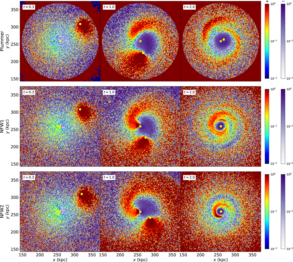
Fig. 3.
Download original image
Evolution of halo overdensity (ρt/ρ0 − 1) maps for the three host halos shown in Fig. 1. Purple colors are for negative overdensity values and red for positive. The upper row corresponds to the Plummer halo model, the middle row to NFW1 (same Vc as the Plummer model out of 30 kpc), and the bottom row to the smaller NFW2 mass model with higher concentration. Each column corresponds to 0.3 (left), 1.0 (center), and 2.0 (right) dynamical times (tdyn), respectively. The host center and the satellite positions are marked by a yellow cross and solid circle, respectively. The wake and the global response are evident in all panels. The Plummer cored model starts to deviate significantly once the core radius is reached by the satellite. There are small quantitative differences in the wake and dipole for each model. At 2.0 tdyn, the global anisotropy is smaller, but other modes are visible.
Current usage metrics show cumulative count of Article Views (full-text article views including HTML views, PDF and ePub downloads, according to the available data) and Abstracts Views on Vision4Press platform.
Data correspond to usage on the plateform after 2015. The current usage metrics is available 48-96 hours after online publication and is updated daily on week days.
Initial download of the metrics may take a while.