Fig. 6.
Download original image
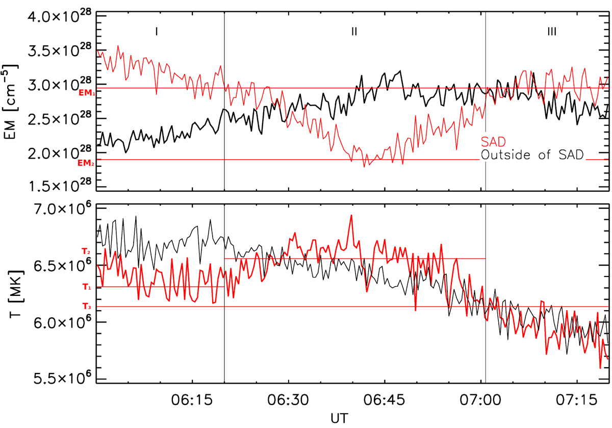
EM and TEM evolution for two positions on the linear cut-a (cf. Fig. 5). The red curve is data from a position passed by the SAD, while the black curve corresponds to a position outside of the SAD. Additional lines are used to highlight features in the red curves. Two vertical lines indicate the selected time interval (II), in which the temporary EM decrease occurs. Horizontal lines highlight the corresponding initial EM value (EM1), minimum EM value (EM2), initial temperature (T1), average maximum temperature (T2) during passage of the SAD, and the temperature (T3) afterwards.
Current usage metrics show cumulative count of Article Views (full-text article views including HTML views, PDF and ePub downloads, according to the available data) and Abstracts Views on Vision4Press platform.
Data correspond to usage on the plateform after 2015. The current usage metrics is available 48-96 hours after online publication and is updated daily on week days.
Initial download of the metrics may take a while.