Fig. 3.
Download original image
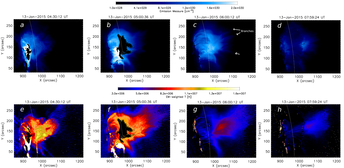
Evolution of the flare as seen in total EM (top) and EM-weighted temperature (bottom). We note the presence of a SAF above the flare loop system, which can be best seen in the temperature maps (f–h). White arrows highlight the branches of alternating high and low EM values in the SAF. The black region at the apex of the loop arcade (e.g., panel b) is an artefact caused by saturation of one or several AIA channels.
Current usage metrics show cumulative count of Article Views (full-text article views including HTML views, PDF and ePub downloads, according to the available data) and Abstracts Views on Vision4Press platform.
Data correspond to usage on the plateform after 2015. The current usage metrics is available 48-96 hours after online publication and is updated daily on week days.
Initial download of the metrics may take a while.