Fig. 5.
Download original image
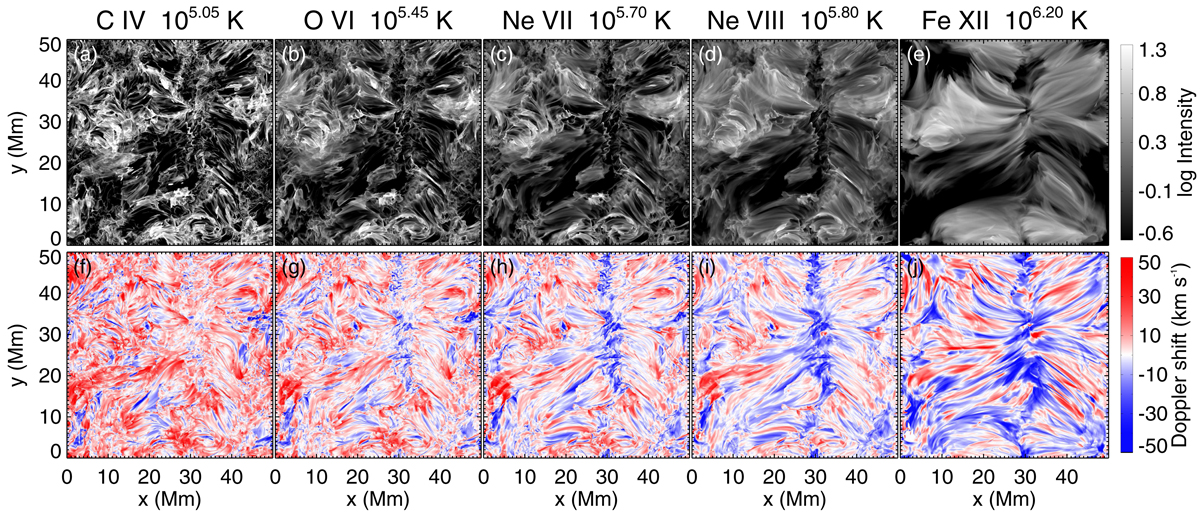
Maps of line intensity and Doppler shift for emission lines from the transition region into the corona. For each line as listed on the very top, the top panel shows the intensity map and the bottom panel shows the Doppler map. The line formation temperature T is given with each ion name. The intensity images are shown on a logarithmic scale with a dynamic range of 100. The Doppler shift saturates at ±50 km s−1. See Sect. 3.4 for more details.
Current usage metrics show cumulative count of Article Views (full-text article views including HTML views, PDF and ePub downloads, according to the available data) and Abstracts Views on Vision4Press platform.
Data correspond to usage on the plateform after 2015. The current usage metrics is available 48-96 hours after online publication and is updated daily on week days.
Initial download of the metrics may take a while.