Fig. 9
Download original image
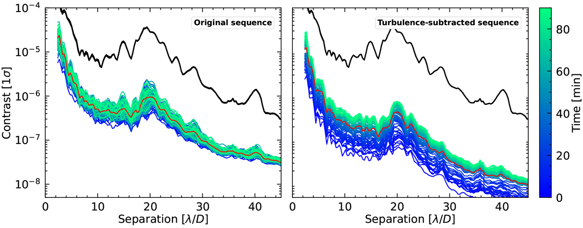
Sensitivity at 1σ in direct coronagraphic images (black lines) and in speckle-subtracted images (colored lines) as a function of time from 0 to 90 min. The profiles are obtained from simulated coronagraphic images based on the 2017-03-25 b original sequence of OPD maps (left) and on the turbulence-subtracted sequence (right). The red curve corresponds to the average sensitivity in coronagraphic images over the full duration of the sequence.
Current usage metrics show cumulative count of Article Views (full-text article views including HTML views, PDF and ePub downloads, according to the available data) and Abstracts Views on Vision4Press platform.
Data correspond to usage on the plateform after 2015. The current usage metrics is available 48-96 hours after online publication and is updated daily on week days.
Initial download of the metrics may take a while.