Free Access
Fig. 3
Download original image
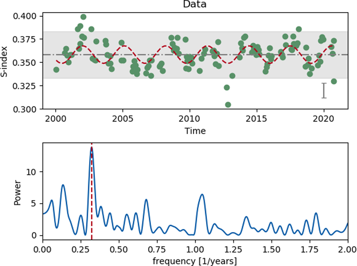
S-index of κ Ceti over a 20 yr time period in the top plot. The grey band marks the range of the solar S-index variability during a solar cycle. The 3.1 yr cycle period is shown as a red dashed curve. The periodogram is shown in the bottom plot, where the strongest frequency is marked by a dashed red vertical line.
Current usage metrics show cumulative count of Article Views (full-text article views including HTML views, PDF and ePub downloads, according to the available data) and Abstracts Views on Vision4Press platform.
Data correspond to usage on the plateform after 2015. The current usage metrics is available 48-96 hours after online publication and is updated daily on week days.
Initial download of the metrics may take a while.