Free Access
Fig. 9.
Download original image
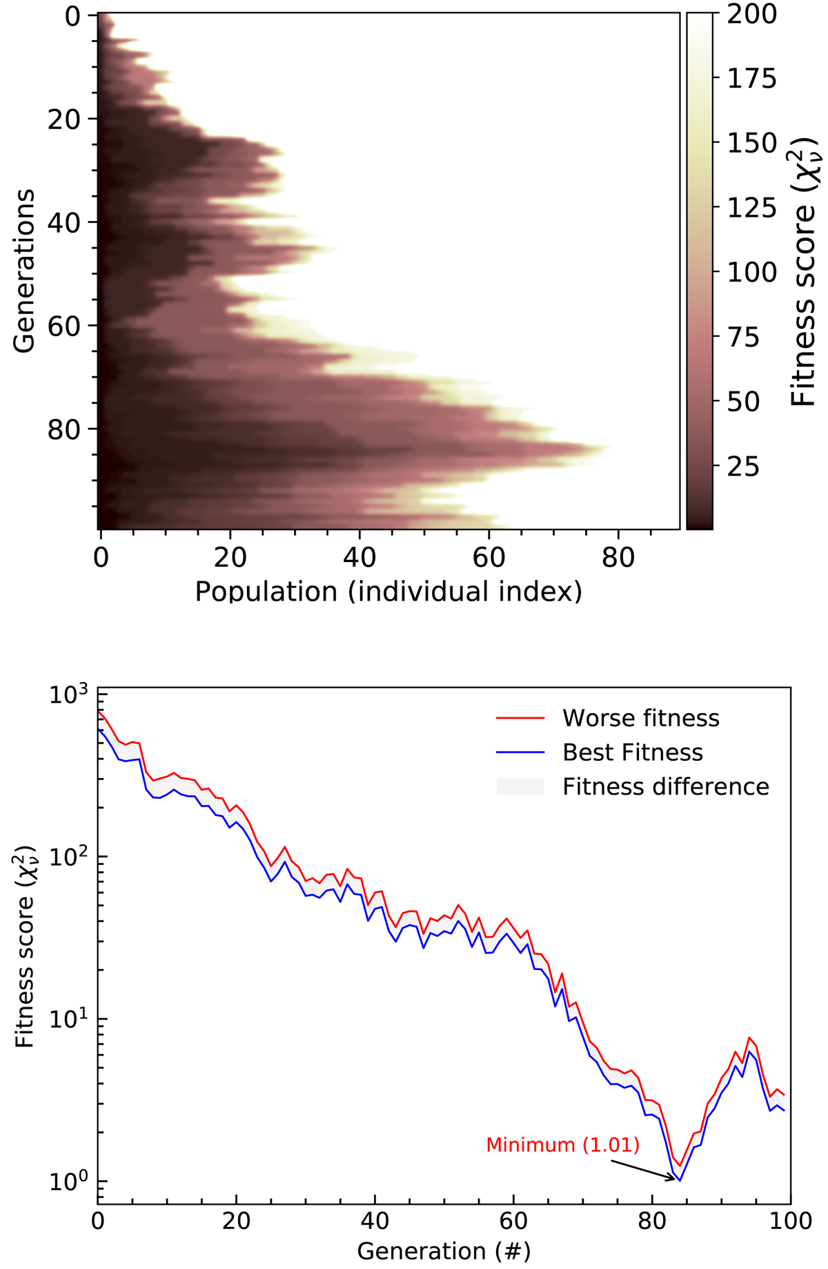
Top: heat map of the fitness score for each population over the generations. Bottom: fitness score over the generations. The blue and red colours indicate the best and worst fitness based on the population of each generation. The grey shaded area between the two lines shows the difference between the worst and best fitness.
Current usage metrics show cumulative count of Article Views (full-text article views including HTML views, PDF and ePub downloads, according to the available data) and Abstracts Views on Vision4Press platform.
Data correspond to usage on the plateform after 2015. The current usage metrics is available 48-96 hours after online publication and is updated daily on week days.
Initial download of the metrics may take a while.