Fig. 1.
Download original image
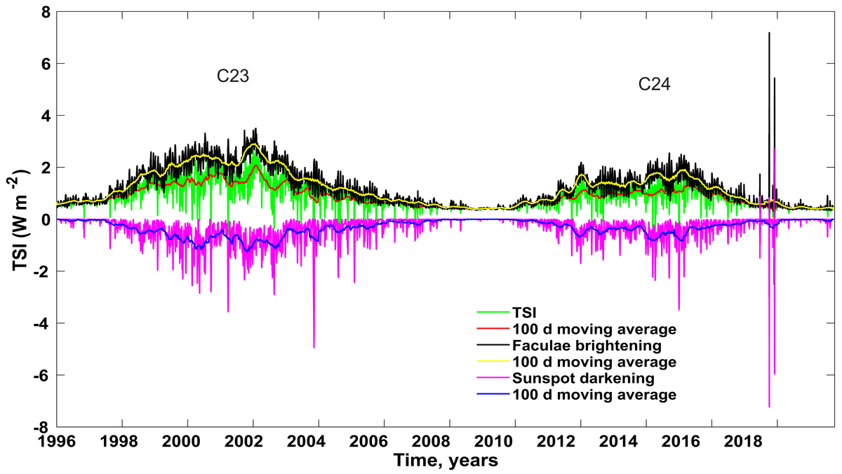
Total solar irradiance (green line) during solar cycles 23–24 from SATIRE-S data in units of W m−2. Red curve shows 100-day moving average of TSI. Black line corresponds to the faculae brightening (with yellow curve as the 100 day average), while the purple line shows the contribution of the sunspot darkening (blue curve as the 100-day average).
Current usage metrics show cumulative count of Article Views (full-text article views including HTML views, PDF and ePub downloads, according to the available data) and Abstracts Views on Vision4Press platform.
Data correspond to usage on the plateform after 2015. The current usage metrics is available 48-96 hours after online publication and is updated daily on week days.
Initial download of the metrics may take a while.