Fig. 5
Download original image
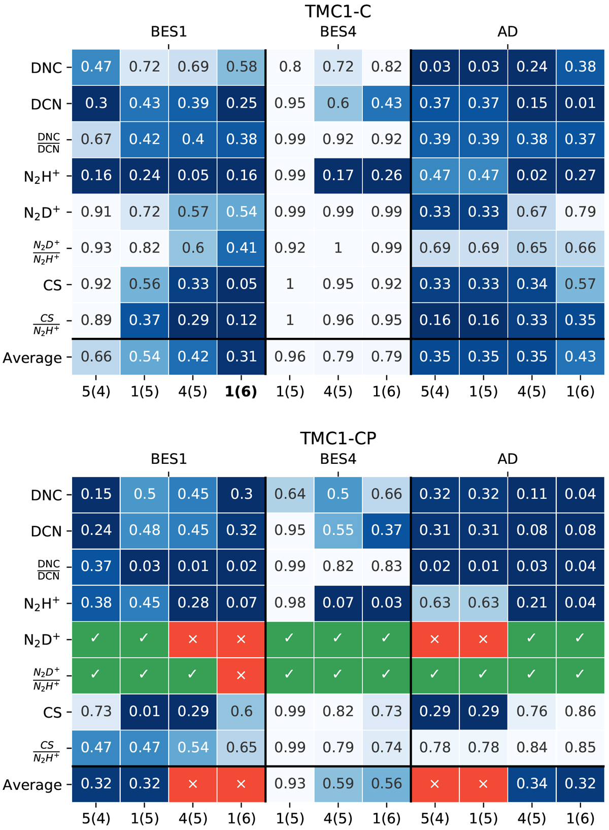
Heat maps of relative differences ![]() (dark blue means better agreement) and their averages between the predictions of each model (BES1, BES4, and AD, upper x-axis) and the observed abundances and ratios. Each column corresponds to a model with density
nH = a × 10b, displayed as a(b). Top: heat map of relative differences in TMC 1-C. The best-fitting model is shown in bold. Bottom: heat map of relative differences in TMC 1-CP. The green and red models are those in agreement and disagreement, respectively, with the observed N2D+ and N2D+/N2H+ upper bounds.
(dark blue means better agreement) and their averages between the predictions of each model (BES1, BES4, and AD, upper x-axis) and the observed abundances and ratios. Each column corresponds to a model with density
nH = a × 10b, displayed as a(b). Top: heat map of relative differences in TMC 1-C. The best-fitting model is shown in bold. Bottom: heat map of relative differences in TMC 1-CP. The green and red models are those in agreement and disagreement, respectively, with the observed N2D+ and N2D+/N2H+ upper bounds.
Current usage metrics show cumulative count of Article Views (full-text article views including HTML views, PDF and ePub downloads, according to the available data) and Abstracts Views on Vision4Press platform.
Data correspond to usage on the plateform after 2015. The current usage metrics is available 48-96 hours after online publication and is updated daily on week days.
Initial download of the metrics may take a while.