Fig. 1.
Download original image
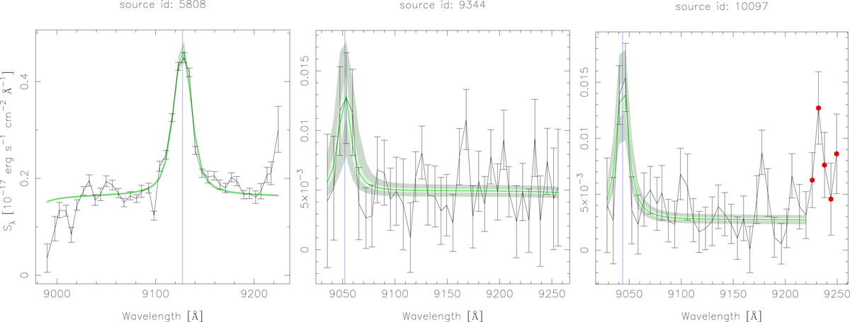
Examples of pseudo-spectra. In each plot, the black line with error bars represents the observed pseudo-spectrum, the green line shows the best fitted result of the deconvolution process, and the light green and light grey shadow area shows the envelope of solutions from the deconvolution process including 25% and 68% of the solutions, respectively. The blue vertical line marks the observed Hβ wavelength. The left plot (id:5808) shows a pseudo-spectrum with a good signal and good fit; the middle plot shows the source id:9344, which has a low signal to noise, and therefore a larger uncertainty in the deconvolution results; the right plot shows the case of the source 10097, where some spurious points in the pseudo-spectrum were masked during the fitting process.
Current usage metrics show cumulative count of Article Views (full-text article views including HTML views, PDF and ePub downloads, according to the available data) and Abstracts Views on Vision4Press platform.
Data correspond to usage on the plateform after 2015. The current usage metrics is available 48-96 hours after online publication and is updated daily on week days.
Initial download of the metrics may take a while.