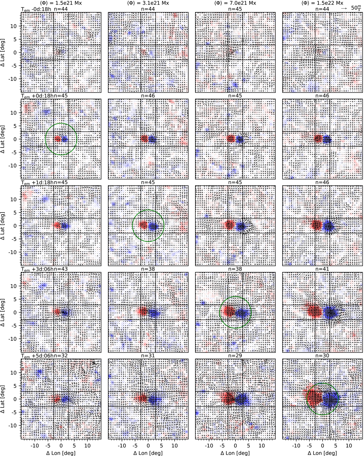
Fig. 4.
Download original image
Evolution (from top to bottom) of the averaged active region magnetic field and flows for the four subsample averages of total unsigned flux (with flux increasing from left to right, cf. the left panel of Fig. 3). Each time step is an average over 12 h, centered on the labeled time. The axis labels are relative to the center of the AR, as defined in Sect. 3.2. For each panel, the total number of active regions that contribute to the average is given at the top. Red (blue) indicates positive (negative) radial magnetic field, saturated at ±150 Gauss. The green circles highlight the time after emergence at which the inflows are first visible in the time steps shown here. The arrows indicate the flows. A reference arrow representing a velocity of 50 m s−1 is given in the upper right corner. The black lines mark the averaging range that was used for the model fit (cf. text and Fig. 6). A moat flow is apparent in the rightmost column at 3 d and 6 h, for instance.
Current usage metrics show cumulative count of Article Views (full-text article views including HTML views, PDF and ePub downloads, according to the available data) and Abstracts Views on Vision4Press platform.
Data correspond to usage on the plateform after 2015. The current usage metrics is available 48-96 hours after online publication and is updated daily on week days.
Initial download of the metrics may take a while.