Fig. 13
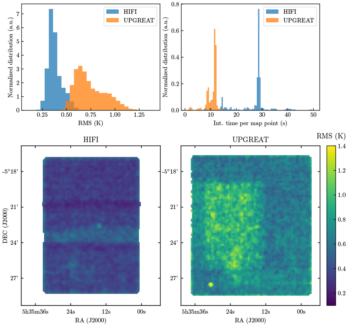
RMS comparison of HIFI and upGREAT between −50 and −20 km s−1. Top left panel: histogram of the RMS map shown in the bottom panels. Top right panel: histogram of the integration time per map point. Bottom panels: spatial distribution of the RMS for HIFI and upGREAT. The region of higher RMS in the upGREAT map is from the first flight when the LFAH LO was not available. Dark horizontal bands in the HIFI map show lower RMS regions that correspond to the overlap between the map tiles.
Current usage metrics show cumulative count of Article Views (full-text article views including HTML views, PDF and ePub downloads, according to the available data) and Abstracts Views on Vision4Press platform.
Data correspond to usage on the plateform after 2015. The current usage metrics is available 48-96 hours after online publication and is updated daily on week days.
Initial download of the metrics may take a while.