Fig. 3.
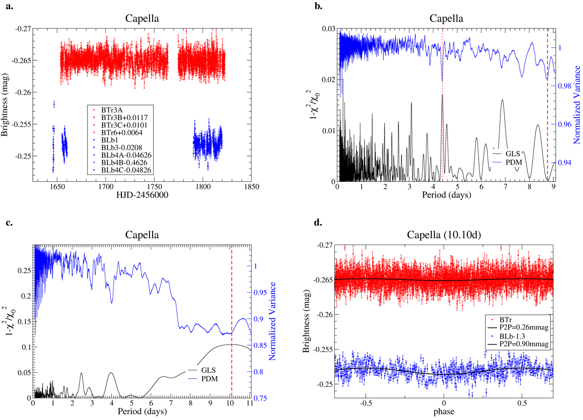
BRITE photometry of Capella. Panel a: full data set. The top light curve is the red BTr data (red dots); the bottom light curve is the blue BLb data (blue dots). The insert identifies the magnitude shifts applied to each individual CCD setup per satellite. Panel b: periodograms of the red data. The top (blue) line is from the PDM given in units of its normalized variance; the bottom (black) line is the generalized LS (GLS) given in units of ![]() . The vertical dashed lines are the periods identified (see text). Panel c: periodograms of the blue data, otherwise as in panel b. Panel d: phase plots for the red data (red dots, top curve) and blue data (blue dots, bottom curve) with the best-fit 10.10 d period. Phases outside ± 0.5 are just repeated.
. The vertical dashed lines are the periods identified (see text). Panel c: periodograms of the blue data, otherwise as in panel b. Panel d: phase plots for the red data (red dots, top curve) and blue data (blue dots, bottom curve) with the best-fit 10.10 d period. Phases outside ± 0.5 are just repeated.
Current usage metrics show cumulative count of Article Views (full-text article views including HTML views, PDF and ePub downloads, according to the available data) and Abstracts Views on Vision4Press platform.
Data correspond to usage on the plateform after 2015. The current usage metrics is available 48-96 hours after online publication and is updated daily on week days.
Initial download of the metrics may take a while.