Free Access
Fig. 14.
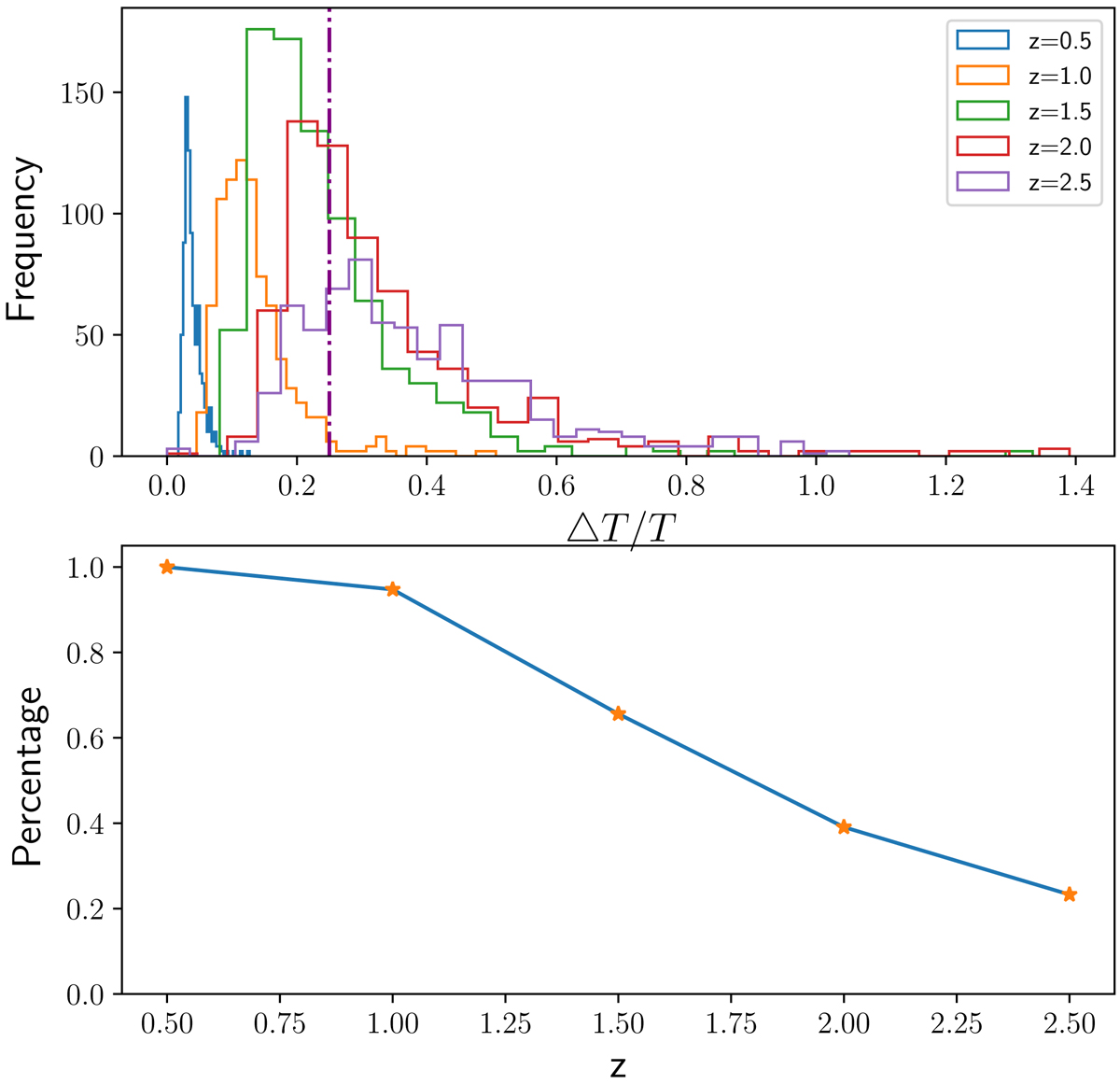
Top: histogram of ΔT/T for each redshift bin. The purple dotted line represents the 25% precision. Bottom: estimated area under the histograms in the above plot at ΔT/T = 25% cut. This area represents the fraction of detected groups at a given redshift that can achieve a temperature precision measurement better than 25%.
Current usage metrics show cumulative count of Article Views (full-text article views including HTML views, PDF and ePub downloads, according to the available data) and Abstracts Views on Vision4Press platform.
Data correspond to usage on the plateform after 2015. The current usage metrics is available 48-96 hours after online publication and is updated daily on week days.
Initial download of the metrics may take a while.