Fig. 8
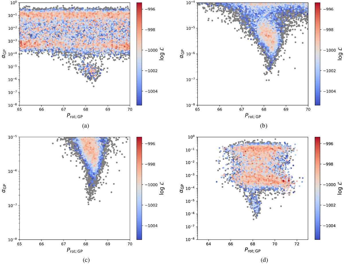
Gaussian-process alpha-period diagram (αGP
vs. PGP) for four runs with different priors listed in Table 6. The color-coding shows a likelihood range of
![]() normalized to the highest achieved log-likelihood within all four runs, and can be compared between the different subplots and runs. Samples with a
normalized to the highest achieved log-likelihood within all four runs, and can be compared between the different subplots and runs. Samples with a
![]() compared to the highest achieved likelihood are shown in gray.
compared to the highest achieved likelihood are shown in gray.
Current usage metrics show cumulative count of Article Views (full-text article views including HTML views, PDF and ePub downloads, according to the available data) and Abstracts Views on Vision4Press platform.
Data correspond to usage on the plateform after 2015. The current usage metrics is available 48-96 hours after online publication and is updated daily on week days.
Initial download of the metrics may take a while.