Fig. 7
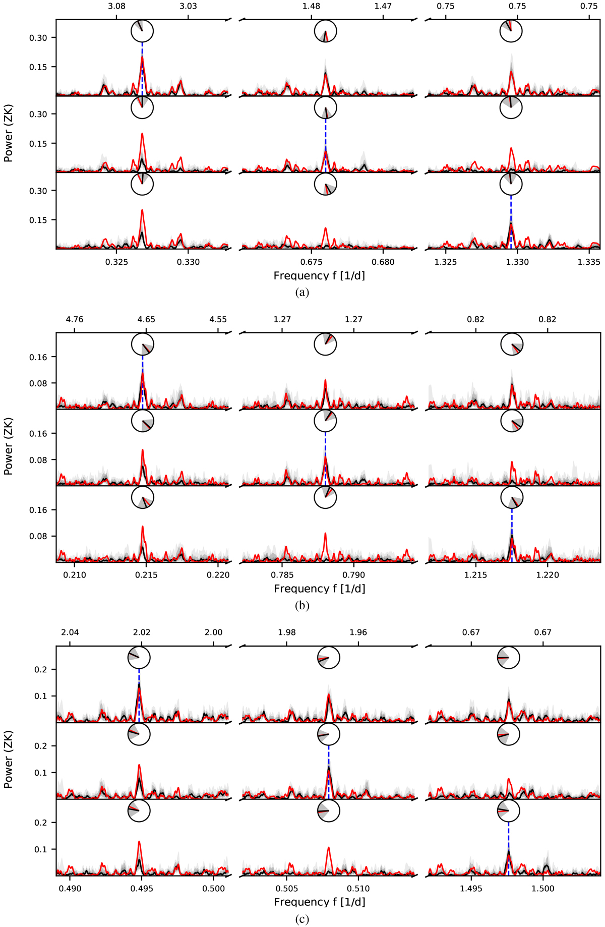
Alias tests for the periods of 3.06 d (a), 4.66 d (b), and 2.02 d (c). In each plot,each row corresponds to one set of simulations. The frequency of the injected signal is indicated by a vertical blue dashedline. From 1000 simulated data sets each, the median of the obtained periodograms (black solid line), the interquartile range, and the ranges of 90 and 99% (shades of gray) are shown. For comparison, the periodogram of the observed data is plotted as a red solid line. Additionally, the angular mean of the phase of each peak and its standard deviation of the simulated periodograms are shown as clock diagrams (black line and grays) and can be compared to the phase of thepeak in the observed periodogram (red line).
Current usage metrics show cumulative count of Article Views (full-text article views including HTML views, PDF and ePub downloads, according to the available data) and Abstracts Views on Vision4Press platform.
Data correspond to usage on the plateform after 2015. The current usage metrics is available 48-96 hours after online publication and is updated daily on week days.
Initial download of the metrics may take a while.