Fig. 9.
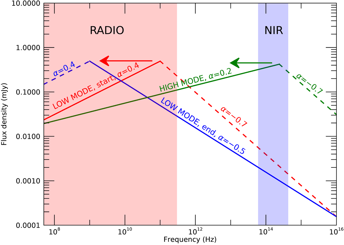
Representation of the possible evolution of the outflow emission spectrum during the high and the low X-ray mode. In red we show the possible synchrotron spectrum of the outflow at the start of the low mode. In blue we plot the possible spectrum of the outflow at the end of the low mode. In green we show the possible spectrum of the outflow at the beginning of the high mode. All the break frequency values have been chosen arbitrarily to explain the model, but the spectral index values and the normalization (flux) values are based on observations. With two arrows we indicate the plausible direction of the evolution of the break frequency. The red and blue regions of the figure represent the radio and NIR bands, respectively.
Current usage metrics show cumulative count of Article Views (full-text article views including HTML views, PDF and ePub downloads, according to the available data) and Abstracts Views on Vision4Press platform.
Data correspond to usage on the plateform after 2015. The current usage metrics is available 48-96 hours after online publication and is updated daily on week days.
Initial download of the metrics may take a while.