Fig. 11.
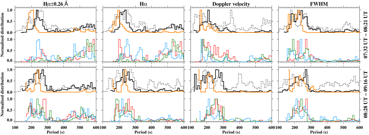
Histograms of the dominant periods (solid lines) of the global power spectrum below 1000 s (normalised to their maximum) within the vortex area (black line, area within the yellow circle in Fig. 10), the swirls within the red, green, and cyan circles in Fig. 10 (red, green, and cyan lines, respectively) and the QSR (orange line, white rectangle in Fig. 1) for the maps in Fig. 10. The dotted lines denote the distributions of the second dominant period of the global power spectrum below 1000 s within the vortex area. We recall that the vortex area distribution contains the entire distribution corresponding to the swirl denoted by a red circle, and parts of the distributions corresponding to swirls denoted by the cyan and green circles in Fig. 10.
Current usage metrics show cumulative count of Article Views (full-text article views including HTML views, PDF and ePub downloads, according to the available data) and Abstracts Views on Vision4Press platform.
Data correspond to usage on the plateform after 2015. The current usage metrics is available 48-96 hours after online publication and is updated daily on week days.
Initial download of the metrics may take a while.