Fig. 3
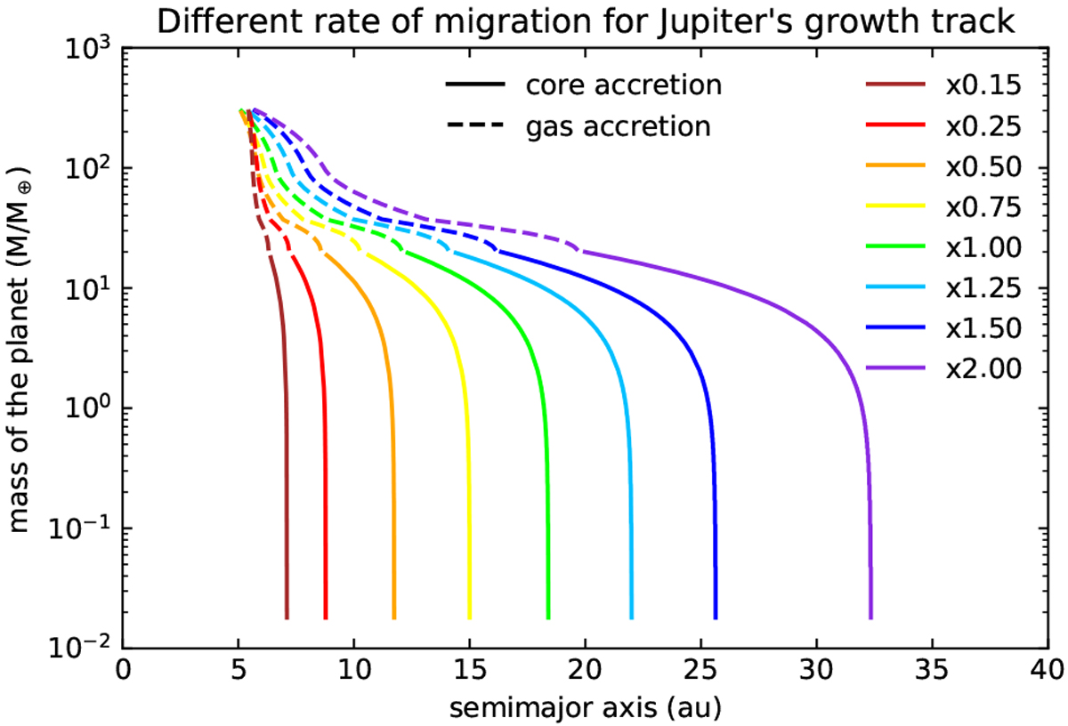
Different rates of migration for Jupiter growth tracks compared to the nominal migration rate (green line). The brown, red, orange and yellow curves are associated with slower migration rates: 0.15, 0.25, 0.50 and 0.75 times the nominal rate of migration, respectively. The blue, dark blue and violet curves are associated with faster migration rates: 1.25, 1.50 and 2.00 times the nominal migration rate, respectively. The solid lines indicate the core accretion phase and the dashed lines indicate the gas accretion phase. Due to interactions between the gas giants during the migration, Jupiter does not exactly end up with the same semimajor axis for each migration rate.
Current usage metrics show cumulative count of Article Views (full-text article views including HTML views, PDF and ePub downloads, according to the available data) and Abstracts Views on Vision4Press platform.
Data correspond to usage on the plateform after 2015. The current usage metrics is available 48-96 hours after online publication and is updated daily on week days.
Initial download of the metrics may take a while.