Fig. 2.
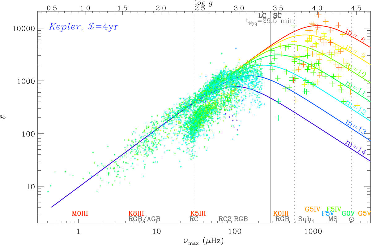
EACF level for Kepler data, homogenized to a uniform observation duration of 48 months, expressed as a function of νmax. The x-axis also shows the corresponding log g. The color designates the stellar magnitude, as indicated by the theoretical level overplotted on the diagram. The three vertical dotted lines indicate, from low to high frequency, the mean location of the red clump, the transition between subgiants and red giants, and the Sun. The vertical solid line indicates the Nyquist frequency of the long-cadence mode of Kepler. Different stellar types and classes are shown parallel to the x-axis, with an independent color code.
Current usage metrics show cumulative count of Article Views (full-text article views including HTML views, PDF and ePub downloads, according to the available data) and Abstracts Views on Vision4Press platform.
Data correspond to usage on the plateform after 2015. The current usage metrics is available 48-96 hours after online publication and is updated daily on week days.
Initial download of the metrics may take a while.