Fig. 1.
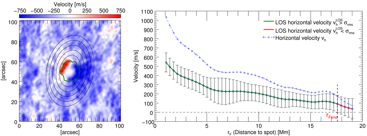
Doppler map (left panel) of AR11641 on 2 January 2013 at 07:30 UT. The green line displays the outline of the spot, and exemplary ellipses, along which the velocity values are read out, are plotted in black. The extension of the flow field is delimited by velocities higher than the rms values (green curve in the right panel). The rms values are plotted as error bars. The blue curve represents the velocity profile corrected for projection effects.
Current usage metrics show cumulative count of Article Views (full-text article views including HTML views, PDF and ePub downloads, according to the available data) and Abstracts Views on Vision4Press platform.
Data correspond to usage on the plateform after 2015. The current usage metrics is available 48-96 hours after online publication and is updated daily on week days.
Initial download of the metrics may take a while.